

Light is the single most misunderstood tool in a photographer’s kit. Most people treat it as background logistics, something to manage rather than sculpt. But the role of light in wall photography goes far deeper than “is there enough of it.” Light decides whether a textured wall feels ancient and alive or flat and forgettable. It shapes mood before the viewer reads a single line of context. The way you direct, color, and layer light against a wall determines whether your image breathes or just exists on a screen.
Table of Contents
Key takeaways
| Point | Details |
|---|---|
| Direction shapes texture | A 45-degree angle reveals surface depth; straight-on light erases it entirely. |
| CRI matters for color truth | Use directional LEDs with a CRI of 97 or higher to avoid color distortion in displayed photography. |
| Wall washing vs. grazing | Washing smooths and widens; grazing dramatizes and reveals. Choose based on mood, not habit. |
| Warm color temperature wins | Lights in the 2700K to 3000K range preserve vibrancy and prevent frames from reading gray. |
| Subject-wall separation counts | Positioning subjects 4 to 6 feet from the wall keeps texture visible and shadows clean. |
The role of light in wall photography: core principles
Before you can make intentional choices, you need to understand what light actually does when it meets a wall. There are four properties that govern every outcome: direction, angle, intensity, and color temperature.
Direction tells the story. Light direction shapes form and depth by controlling how your eye reads a surface. A 45-degree angle describes texture on vertical surfaces reliably, while a 90-degree raking angle pushes dramatic shadow contrast to its maximum. Light coming straight at a wall fills every micro-shadow and kills depth.
Color temperature shifts feeling. Warm light wraps a space in memory and intimacy. Cool light clears it out and makes it feel clinical. This is not just aesthetic preference. Warm color temperature preserves emotional tone in photographic displays, while cool white at 5000K or above drains the color from frames and prints.
Intensity controls drama. Too much light flattens contrast. Too little muddies color fidelity. Both are enemies of a wall photograph that is meant to hold attention.
Pro Tip: When evaluating a lighting setup, photograph a piece of white paper held against your wall. If it reads yellow-orange or blue-white instead of neutral, your color temperature needs adjustment before you shoot.
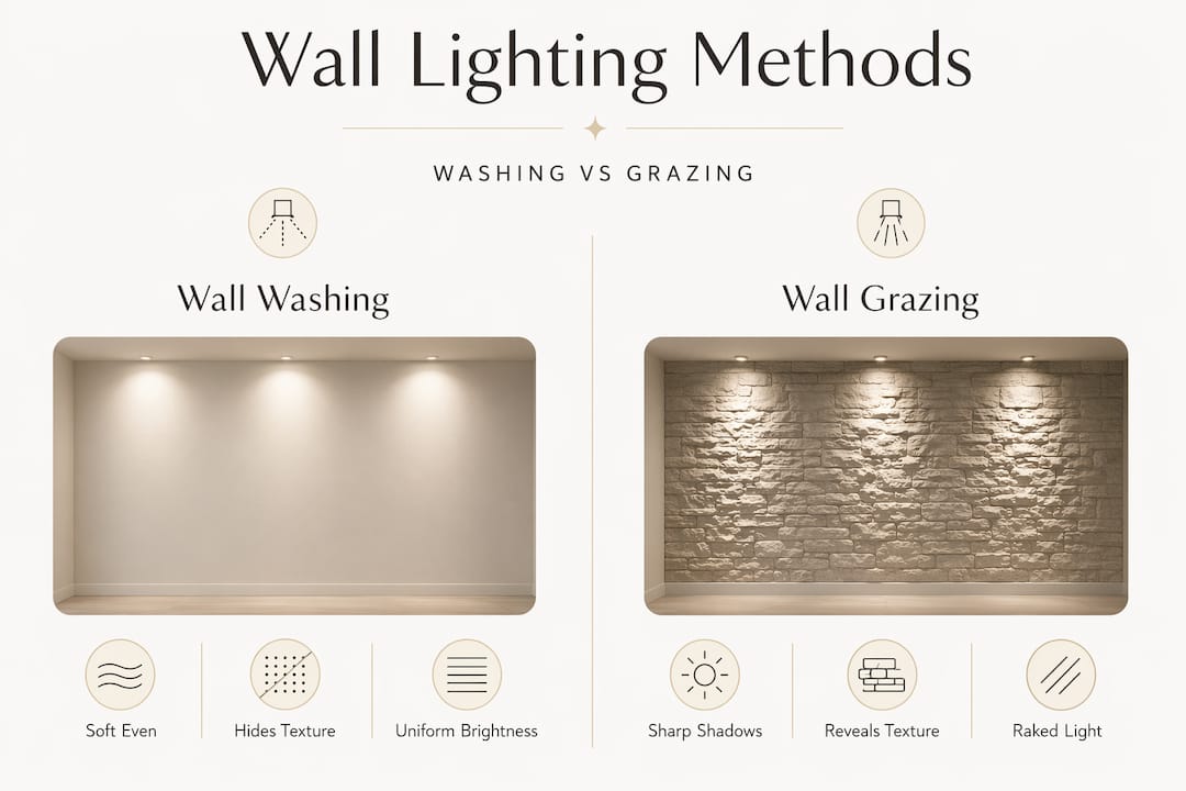
Two specialized techniques define how photographers approach the importance of light in photography as it applies to walls specifically: wall washing and wall grazing. They look similar in description but produce opposite effects.
Wall washing vs. grazing: what the difference looks like
These two lighting techniques for photography are often confused, but choosing the wrong one can completely undermine your intent.
| Technique | Fixture distance from wall | Primary effect | Best use case |
|---|---|---|---|
| Wall washing | 12 to 36 inches | Smooth, even brightness | Concealing texture, clean backgrounds |
| Wall grazing | 6 to 12 inches | Dramatic highlights and shadows | Revealing texture, dimensional art displays |
Wall washing places fixtures 12 to 36 inches from the surface to create uniform, diffuse brightness. It softens everything and works beautifully when you want a backdrop that disappears rather than speaks. Architectural photographers use it for clean, distraction-free environments.
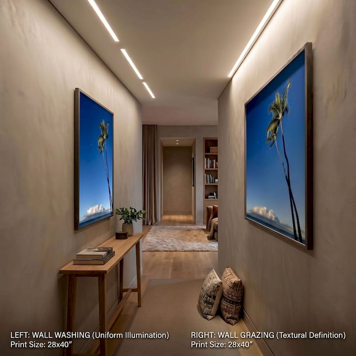
Wall grazing pulls fixtures in tight. Grazing requires positioning 6 to 12 inches from the wall, and the result is a raking light that sculpts every bump, groove, and grain. For a travel print shot on textured canvas or mounted on a rough plaster wall, grazing makes the surface feel tactile and alive.
Pro Tip: Test both techniques on the same wall before committing to a setup. Photograph the wall with grazing light first, then pull the fixture back to wash the wall. Compare the two images side by side. Your creative intention will become immediately obvious.
The emotional stakes here are real. Grazing light carries weight and warmth. It reads as handcrafted, layered, rich. Washed light reads as open, modern, minimal. Neither is wrong. But the choice should come from your story, not from whatever fixture was already installed.
Setting up indoor lighting for wall photography
Practical execution is where photography tips for wall shots either pay off or fall apart. Here is how to set up thoughtfully for indoor environments.
-
Position natural light at an angle, not head-on. A window to the side of your wall creates natural raking light that reveals texture. A window directly facing the wall flattens it. If you cannot control window placement, use a sheer curtain to diffuse the light and reposition with a reflector.
-
Choose directional LED fixtures with high CRI. Directional LEDs rated at CRI 97 or higher are the standard for accurate color rendering. Lower CRI sources distort the tones in your photography, particularly in warm shadow areas.
-
Use track lighting for flexibility. Track systems let you adjust angle and position without rewiring. For wall photography that changes seasonally or by project, this adaptability is worth every penny.
-
Control glare with beam optics. Precise aiming around 30 degrees minimizes glare and preserves color accuracy on framed photography. Glare is not just distracting. It bounces off glass frames and erases fine detail in your image.
-
Separate your subject from the wall. Positioning subjects 4 to 6 feet from the wall prevents shadows from blending subject and backdrop into a single visual mass. This separation is what gives a photograph dimensional storytelling instead of a flat, pasted look.
-
Stay in the 2700K to 3000K range. Warm lighting in this range keeps wood frames looking rich and prevents prints from washing out into gray.
Pro Tip: Layer your light. Use a directional fixture for your wall art as the primary source, then add a softer ambient fill from the opposite side. This separation between key and fill light creates the depth that makes a photograph feel three-dimensional rather than decorative.
Using LED walls in studio photography
For photographers working in controlled studio environments, LED light walls offer a powerful way to simulate the quality of natural window light. The concept is straightforward: a large, flat panel of LED sources diffused evenly across a broad surface to mimic the soft, wrapping quality of overcast daylight.
The benefits are significant:
-
Consistent, repeatable light quality across every session
-
Adjustable color temperature from warm to cool without gelling
-
Broad, diffuse coverage that wraps a wall background without harsh falloff
-
A raking angle reveals texture like brushstrokes and paint grain when the panel is positioned at the proper angle
The pitfalls are equally real and worth knowing before you build or buy. Insufficient LED density forces higher ISO, which introduces noise into your images. Improper diffusion causes visible striping across your wall backgrounds. Both problems are architectural, meaning they cannot be fixed in post. The layout of LED density and diffusion must be planned before a single fixture goes up.
For photographers transitioning from natural to studio light, the LED wall is the closest analog to a north-facing window. It rewards the same intuitions you built outdoors.
How light shapes mood and visual storytelling
How light affects wall photography is ultimately a question of feeling. Technical accuracy matters, but what makes a viewer stop and stay with an image is emotional resonance.
Consider the choices in front of you:
-
Warm, low-angle light suggests late afternoon, memory, the golden hour quality of a California coast or a desert road at dusk
-
Cool, even light signals modernity and precision, working for architectural and documentary photography
-
High-contrast grazing carries drama and weight, perfect for travel photography that wants to feel tactile and earned
-
Soft, diffused washing creates an airy, gallery-like calm that lets the subject of the photograph carry all the narrative weight
Paint color matters here too. Low LRV paint colors absorb more light and require supplemental directional lighting to avoid appearing flat or dark. If your wall is deep navy or charcoal and you want a photograph to read true against it, you need to compensate with focused supplemental light on the art itself.
Best lighting for indoor photography is not one temperature or one fixture type. It is the right combination of warmth, angle, and intensity for the story you are trying to tell.
What we have learned about light from years with wall art
We will be direct about something the usual photography advice skips over. Most of us spend our early years obsessing over the photograph itself while treating the wall and its light as an afterthought. That order should be reversed.
What we have found in working with travel photography displayed across dozens of interior environments is that the same print can look like a memento or a masterpiece depending entirely on how it is lit. A coastal photograph printed on canvas under cool fluorescent light loses its salt-air quality completely. Under a warm 2700K directional fixture with a slight grazing angle, the same image feels like a window to the place where it was taken.
The thing most enthusiasts miss is fixture angle. Not just direction, but the precise tilt. A few degrees changes how shadows fall on the frame edge and how the surface of the print reads. Experimenting with that tilt, even incrementally, transforms a flat display into something that feels dimensional and considered.
Our advice: treat light as a co-author of your wall photography. Not a setting to check off, but a creative decision that carries as much weight as composition or subject matter. The photographers who internalize this produce work that stays with people long after they have left the room.
— Info
Light your walls, then let the art speak
Every lighting insight in this article leads to the same conclusion: the art you choose and how you light it are inseparable partners in visual storytelling.
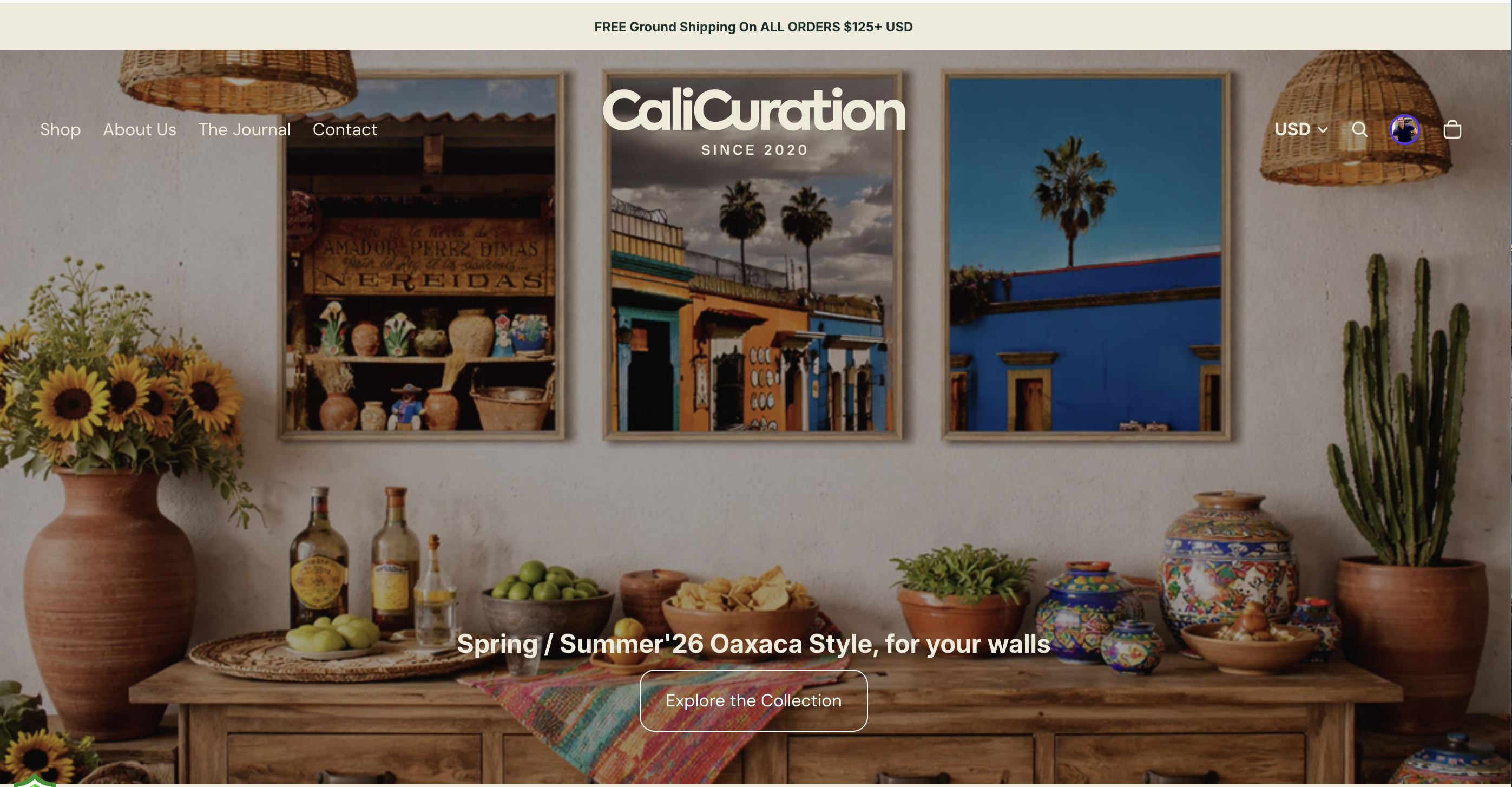
At Calicuration, every piece in our collection is shot to hold up under real light. Coast, desert, city glow, architectural shadow studies. Our travel photography prints are designed to reward the kind of thoughtful lighting you have been reading about here. If you want to see how grazing light transforms a textured canvas or how warm color temperature makes a framed travel print feel like a collected memory rather than a decoration, our collection is the place to start. Every order is custom-produced and ships with the intention that your space will feel lighter, warmer, and genuinely yours.
FAQ
What is the role of light in wall photography?
Light controls texture, mood, color accuracy, and depth in wall photography. Its direction, intensity, and color temperature determine whether a wall photograph reads as flat or dimensional.
What color temperature is best for lighting wall photography indoors?
Warm color temperatures between 2700K and 3000K preserve vibrancy and prevent frames from looking gray or washed out, making them the preferred range for both residential and gallery wall photography.
What is the difference between wall washing and wall grazing in photography?
Wall washing uses fixtures placed 12 to 36 inches from the wall for smooth, even light that hides texture. Wall grazing positions fixtures 6 to 12 inches away to create dramatic shadows that reveal surface detail and depth.
Why does CRI matter for wall photography lighting?
A CRI of 97 or higher is recommended for accurate color rendering. Lower CRI sources distort warm tones and shadow detail in displayed photographs, making the image look different than intended.
How far should a subject be from the wall for clean texture and separation?
Positioning your subject 4 to 6 feet from the wall prevents shadows from merging subject and backdrop, keeping both texture and separation clearly visible in the final image.