

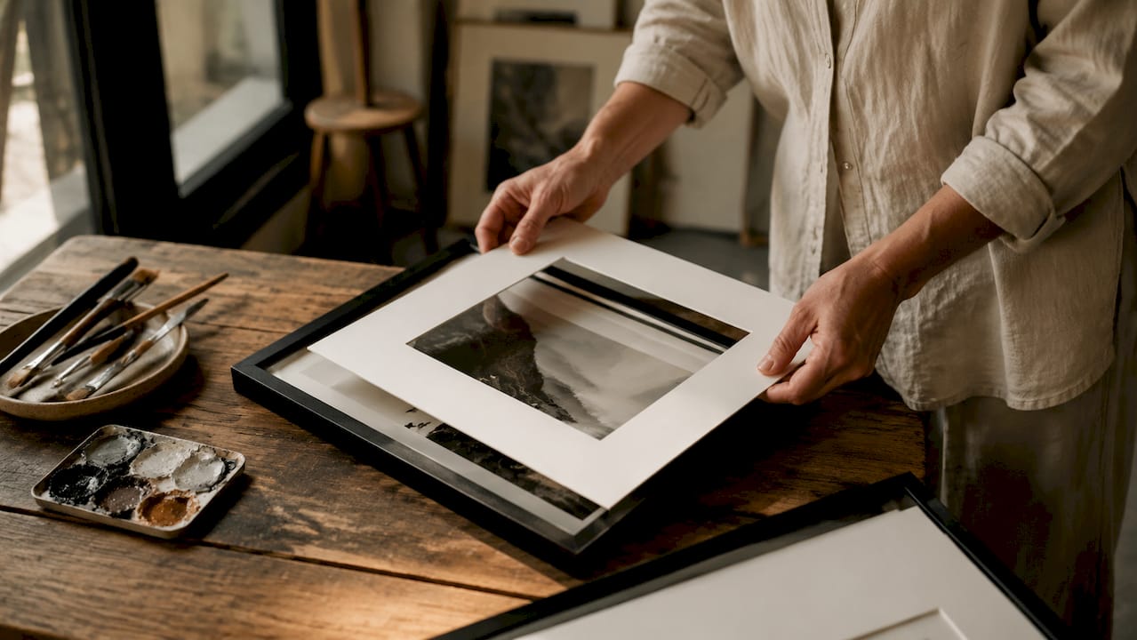
Styling black and white photography prints is the art of combining tonal contrast, frame selection, print materials, and spatial placement to create decor that feels both timeless and deeply personal. A well-curated monochrome wall does more than fill space. It tells a story, anchors a room, and gives your home the quiet confidence of a collected life. In this guide, we walk you through every decision, from choosing the right contrast mix to hanging height, so your grayscale photo prints land with intention and warmth.
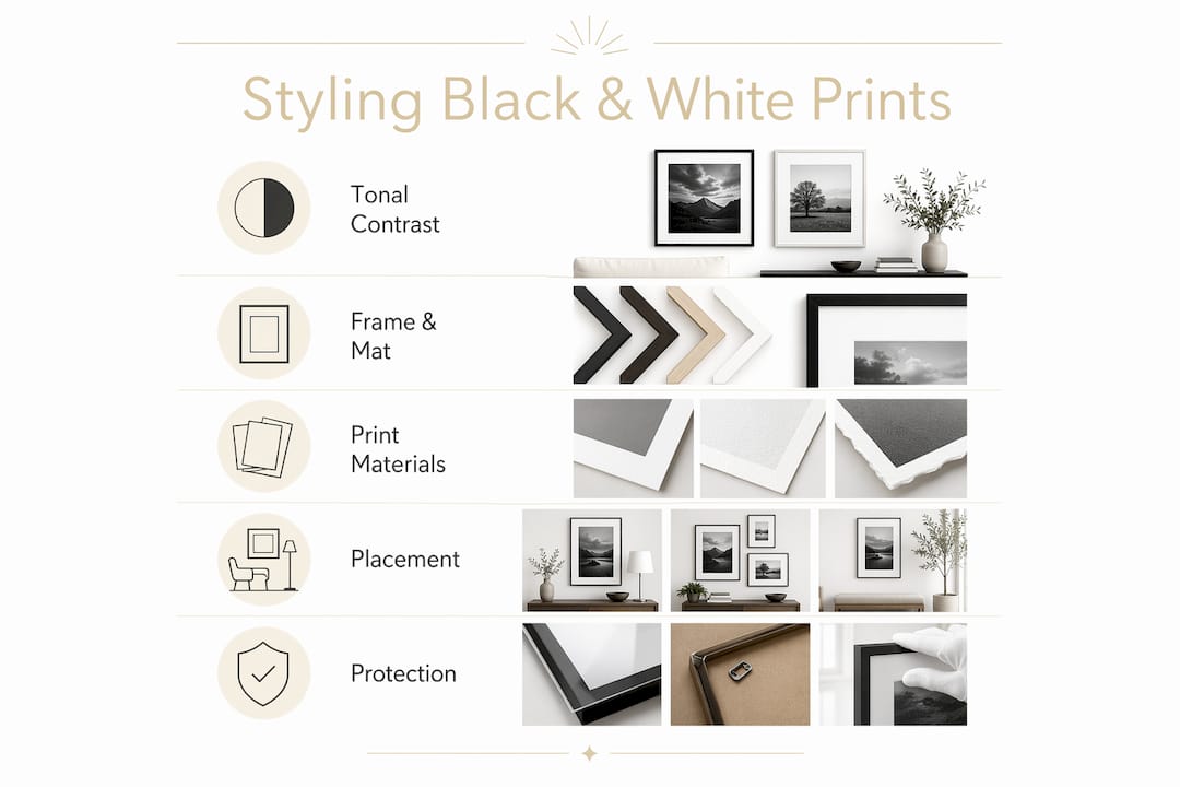
How to style black and white photography prints with tonal contrast
Tonal contrast is the single most important variable when you style black and white photography prints. GalleryPlanner recommends filling 60 to 70% of a gallery wall with full-range or medium-contrast images, then using a few high-contrast pieces as visual punctuation. This balance keeps the wall from feeling either aggressively stark or dull and flat.
Think of it like typographic hierarchy. Mid-tones are your body text, steady and readable. Deep blacks and bright whites are your headlines, used sparingly to direct the eye. Tonal variety controls emotional impact in a way that uniform contrast simply cannot.
Here are the three contrast families worth knowing:
- Classic film contrast. Rich blacks, bright whites, and a full tonal range. These prints feel bold and cinematic. They work well as anchor pieces in living rooms or hallways.
- Soft vintage. Lifted shadows and muted highlights give prints a warm, nostalgic quality. Think of old travel photographs with a faded silver tone. These are ideal for bedrooms or reading nooks.
- Fine art dramatic. Deep, inky shadows with selective bright zones. This style draws the eye immediately and suits statement walls where you want one print to do all the talking.
Pro Tip: When building a gallery wall, place your highest-contrast print slightly off-center rather than dead center. It creates a more organic, collected feel, as if the wall grew over time rather than being installed in an afternoon.
| Contrast style | Best room | Emotional tone |
|---|---|---|
| Classic film | Living room, hallway | Bold, confident |
| Soft vintage | Bedroom, study | Warm, nostalgic |
| Fine art dramatic | Entryway, statement wall | Striking, focused |
What frames and mats best enhance monochrome photo art
The frame is the handshake between your print and your room. Get it wrong and even a stunning photograph feels out of place. Get it right and the whole wall breathes.
For most black and white wall decor, these frame styles work consistently well:
- Simple black frames. Classic and bold, these suit high-contrast prints in modern, industrial, or minimalist interiors. Black frames pair naturally with high-contrast monochrome art and contemporary design styles.
- Natural wood frames. Warm and tactile, these soften the graphic quality of monochrome prints. They work beautifully in Scandinavian, bohemian, or coastal spaces.
- White or off-white frames. These create a clean, airy presentation. They are especially effective for soft vintage or fine art prints where you want the image to feel like it floats.
- Thin gold frames. Used selectively, gold adds a touch of warmth and refinement. Pair with soft-toned prints for a collected, gallery-at-home feel.
For matting, white or off-white mats at 2 to 3 inches keep the viewer’s focus on the photograph rather than the frame. Black mats add drama and work well for larger prints where you want a more theatrical presentation.
Avoid ornate or heavily carved frames. They compete with the image and undercut the quiet authority that artistic monochrome prints carry naturally.
Pro Tip: Always choose UV protective glazing for any print you plan to display long-term. It protects against fading without adding visible color cast, and it is one of the most overlooked steps in home print care.
Which print materials best showcase artistic monochrome prints
The paper and printing method behind a monochrome print determine whether it looks like fine art or a laser-printed page. The difference is visible from across the room.
Fine art papers like Hahnemühle Photo Rag Baryta combined with printing methods such as Piezography or high-end Epson printers deliver smooth tonal gradations and archival quality that mass-market prints simply cannot match. Baryta paper, in particular, has a subtle sheen that mimics traditional darkroom fiber-based paper, giving prints a depth and richness that feels genuinely photographic.
Here is how the main finish types compare:
| Finish | Visual quality | Best use |
|---|---|---|
| Matte fine art | Soft, no glare, premium texture | Gallery walls, overhead lighting |
| Baryta / lustre | Rich depth, slight sheen | Statement pieces, controlled lighting |
| Glossy | High contrast, vivid | Avoid for display; prone to glare |
Matte fine art and baryta papers give prints a premium appearance that reads as intentional and considered. Glossy surfaces reflect overhead light irritatingly, which is why matte or museum surfaces are preferred in most home environments. If you are investing in a print you love, the paper it lives on matters as much as the image itself.
How to arrange black and white prints in different rooms
Placement is where styling decisions become visible. A beautiful print hung at the wrong height or in the wrong room loses half its power.
Start with the standard: hang prints so the center of the image sits at 57 to 60 inches from the floor. This aligns with average eye level and is the standard used by most galleries. For a gallery wall, treat the arrangement as a single unit and center that unit at eye level rather than centering each individual piece.
For room-specific guidance:
- Living rooms. Calm fine art landscapes and soft-toned travel photography create a grounded, restful atmosphere. Place a larger anchor print above the sofa and build outward with smaller pieces.
- Hallways. Bold abstracts and high-contrast street photography work well here. The brief viewing time means strong visual impact matters more than subtlety.
- Bedrooms. Soft vintage prints and intimate compositions feel right. Avoid anything too graphic or high-contrast, which can disrupt the calm you want in a sleeping space.
- Home offices. Architectural photography and geometric abstracts add focus and quiet energy without distraction.
Monochrome prints act as neutral anchors in modern interiors. High-key backgrounds open a space visually, while dark subjects add depth and drama. This tonal flexibility makes black and white wall decor one of the most versatile choices across interior styles, from minimalist to maximalist.
Common styling mistakes and how to care for your prints
The most common mistake is building a wall with uniform contrast throughout. All high-contrast prints create visual aggression. All low-contrast prints feel washed out and timid. Mixing intentionally, as described above, solves both problems.
The second mistake is choosing frames that compete with the artwork. Ornate gold frames on a gritty street photograph, or thin black frames on a soft, dreamy landscape, create a mismatch that reads as unresolved. Let the print lead and the frame follow.
For long-term care, UV protective glazing and acid-free storage are non-negotiable for collectors and enthusiasts who want their prints to last decades. Keep prints away from direct sunlight and high-humidity rooms like bathrooms.
“The best-styled walls feel like they were collected slowly, one meaningful piece at a time, rather than purchased all at once.”
Pro Tip: If your prints hang in a room with unavoidable overhead lighting, always choose matte or museum-surface papers. Glossy surfaces under overhead light create distracting reflections that pull attention away from the image itself.
Key takeaways
Styling black and white photography prints well requires tonal variety, frame restraint, quality paper, and placement that respects both the art and the room.
| Point | Details |
|---|---|
| Tonal mix is the foundation | Use 60 to 70% medium-contrast prints with a few high-contrast pieces as accents. |
| Frames should support, not compete | Simple black, natural wood, or white frames keep focus on the photograph. |
| Paper quality defines the result | Matte fine art or baryta papers deliver premium tonal depth and archival longevity. |
| Placement follows eye level | Hang prints with the center at 57 to 60 inches for gallery-standard presentation. |
| Care protects your investment | UV glazing and acid-free storage preserve prints for decades of display. |
Why we think contrast is the most underrated styling decision
Most decorating guides focus on frame color and hanging height. We think the real work happens before the print ever touches the wall. It happens when you choose which images belong together and how their tones relate to each other.
We have seen beautifully framed prints fall flat because every piece on the wall carried the same tonal weight. And we have seen modest frames transform a room because the prints themselves were chosen with tonal intention. The role of light in photography is what separates a print that feels alive from one that just fills space.
Our honest recommendation: before you buy a frame or measure a wall, lay your prints out on the floor and look at them together. Notice where your eye goes first, where it rests, and where it loses interest. That exercise tells you more about your wall than any grid template will.
— Calicuration
Bring your walls to life with Calicuration
Calicuration’s black and white collection is built from original, founder-shot travel photography, capturing coast, desert, and city light in prints that feel like memory made visible. Every piece is custom-produced on demand, printed on premium materials, and curated to give your space a sense of warmth and individuality that mass-market art simply cannot offer.
Whether you are building your first gallery wall or adding a single statement piece, our wall art collection gives you a starting point that is already story-driven. Browse framed prints, canvas options, and grayscale photo prints designed to work with the styling principles in this guide. And with 5% of every order supporting community impact in Los Angeles and New York City, your wall becomes part of something larger than the room it lives in.
FAQ
What is the best tonal mix for a black and white gallery wall?
GalleryPlanner recommends filling 60 to 70% of a gallery wall with medium or full-range contrast images and using a few high-contrast prints as visual punctuation to avoid a flat or aggressive look.
What frame color works best for monochrome prints?
Simple black frames suit high-contrast and modern styles, while natural wood and white frames work well for softer or vintage-toned prints. Avoid ornate frames that compete with the image.
What paper should I use for fine art black and white prints?
Hahnemühle Photo Rag Baryta and similar matte fine art papers deliver the smoothest tonal range and archival quality. Glossy papers cause glare under overhead lighting and are best avoided for display.
How high should I hang black and white photography prints?
Hang prints so the center of the image sits at 57 to 60 inches from the floor, which aligns with average eye level and matches standard gallery practice.
How do I protect black and white prints from fading?
Use UV protective glazing and acid-free storage materials, and keep prints away from direct sunlight and high-humidity environments to preserve them for decades.