

Table of Contents
- Why Global Aesthetic Art Belongs in a Neutral Room
- Start With Art for a Neutral Living Room
- How to Add Color to a Neutral Room Without Overwhelming It
- Layer Texture and Natural Materials for Depth
- Gallery Wall Ideas for Neutral Rooms
- How to Choose Wall Art Size and Placement
- Source Global Art Respectfully and Mix Traditions
- Frequently Asked Questions
Last Updated: October 19, 2026
Why Global Aesthetic Art Belongs in a Neutral Room
A neutral room is a quiet shell. Global aesthetic art is what makes that shell feel lived in.
Neutral palettes give you calm. They also give you a blank canvas with no story. Travel photography solves that problem. One framed canvas of a sunlit Oaxaca street brings color, culture, and a sense of elsewhere into a room that would otherwise feel flat.

Below, we walk through how to choose, place, and layer global art so a neutral space feels warm and collected rather than empty. The approach is simple, and it works in any room.
Start With Art for a Neutral Living Room
Art for a neutral living room should come before the accessories, not after. Pick the artwork first, then let the room answer it. This is the opposite of how most people decorate, and it is why so many neutral rooms end up feeling unfinished.
Here is how we would do it:
- Choose one anchor piece that speaks to a place you love.
- Pull two or three colors from that piece into the room.
- Keep everything else quiet.
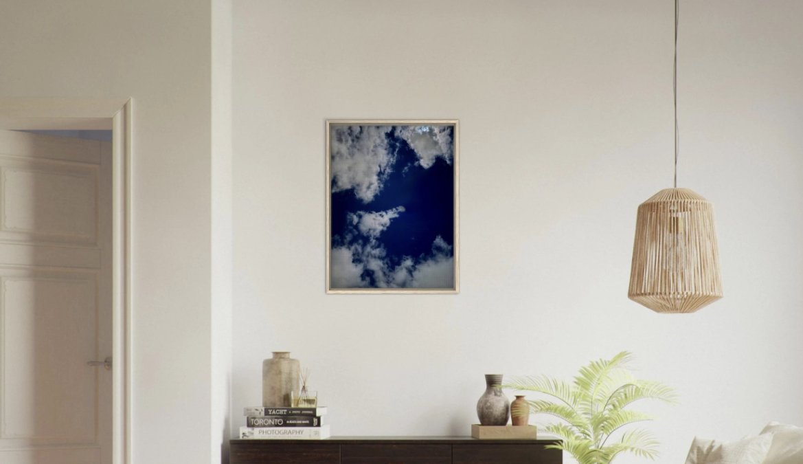
A large framed canvas above the sofa does the heavy lifting. Something like our Oaxaca Street Fair Framed Canvas, printed on cotton-polyester canvas and framed in FSC-certified wood, gives a neutral room a warm, textured focal point without shouting.

How to Add Color to a Neutral Room Without Overwhelming It
The trick to adding color to a neutral room is repetition, not volume. One bold piece, echoed in small doses, reads as intentional. One bold piece with nothing to answer it reads as random. We go a step further, because global art asks a harder question: which color do you pull, and how much of it?
A repeatable framework for pulling color from global art
Most people pull the brightest color in a piece. That is usually the wrong move. A market scene might have a dozen saturated hues, and echoing all of them turns a calm room into a bazaar. Instead, work through this sequence:
- Find the dominant hue. Squint at the piece from across the room. The color that survives the squint is your anchor. In a landscape, it is often the sky or the ground, not the flowers.
- Check the undertone. Warm reds and ochres sit comfortably beside oatmeal and greige. Cool blues and greens need a warm neutral nearby or they read cold. Match the undertone, not just the hue.
- Set a ratio. A common pattern among stylists is roughly 60 percent neutral, 30 percent secondary neutral, and 10 percent accent. Global art lets you push the accent slightly higher because the artwork itself carries visual weight.
- Repeat in three places, at three scales. A large textile, a medium ceramic, and a small book spine or candle. Three scales keep the echo from looking like a matched set.
- Stop at three. A fourth repetition tips a restrained room into a themed one.
Why global art changes the color math
A single-region print usually carries one dominant hue and one supporting tone. A piece that spans regions, a street scene with painted walls, textiles, and sky, carries three or four. The more hues a piece contains, the quieter your accents should be, because the art is already doing the color work.
Our Oaxaca Palm Tree in Blue Framed Canvas is a good example of a piece with one clear dominant hue. Its vivid blue does the color work for you, so a couple of blue accents nearby are all the room needs. A denser street scene, by contrast, wants the room to stay quieter so the art can lead.
Warm and cool together
Global art is one of the few places where mixing warm and cool tones works without effort, because the artwork itself holds the tension. A cool blue print against a warm wood frame and a linen sofa is a classic pairing. The frame does the bridging work, which is why we offer black, natural wood, and dark brown finishes, each one shifts how warm or cool the same print reads on the wall.
Layer Texture and Natural Materials for Depth
Texture is what stops a neutral room from feeling flat. Color gets the attention, but texture does the quiet work. Layer natural materials and the room gains depth without gaining clutter.
Try mixing:
- Linen on the sofa or curtains
- Woven fabrics in a basket or throw
- Raw stone on a side table
- Warm wood on frames and furniture
- A vintage rug underfoot
Our frames come in black, natural wood, or dark brown, so you can match the wood tone to the rest of the room. Natural wood warms a cool palette. Black adds contrast.
Gallery Wall Ideas for Neutral Rooms
Gallery wall ideas for neutral rooms work best when the art carries the color and the frames stay calm. A grid of matching frames lets the images do the talking. A mixed-frame layout feels more collected.
Two layouts we like:
- The grid: same frame, same size, tight spacing. Clean and modern.
- The salon: mixed sizes and frames, built around one anchor piece. Warm and collected.
Keep the gap between frames consistent, and treat the whole group as one shape. For a global collection, mix a street scene, a landscape, and an abstract so the wall feels like a journey rather than a theme.
How to Choose Wall Art Size and Placement
How to choose wall art size comes down to one rule: the art should relate to the furniture below it. Too small and the wall looks empty. Too large and the room feels squeezed.

Use these guidelines:
- Above a sofa: art should span about two-thirds of the sofa width.
- Center point: hang the middle of the art at eye level.
- Above a console: leave a small gap between the art and the tabletop.
When in doubt, go bigger. A single large canvas usually beats a cluster of small frames in a neutral room. Our Modern Abstract Canvas Wall Art comes in multiple sizes, which makes it easy to fit an awkward wall.
Source Global Art Respectfully and Mix Traditions
Global aesthetic art should carry context, not just color. This is the part most neutral-room guides skip entirely, and it is the part that matters most when you are bringing art from cultures that are not your own. Respectful sourcing keeps the story honest, and it keeps a collected room from sliding into decoration that borrows without crediting.
A provenance checklist before you buy
Before a piece earns a place on your wall, we suggest running it through five questions:
- Who made it? A named photographer, artist, or maker, not 'various' or 'unknown.' If a seller cannot name the creator, that is a signal.
- Where was it made, specifically? A region or city, not just a continent. 'Oaxaca' tells you more than 'Mexico,' and 'Kyoto' more than 'Asia.'
- What does the subject mean to the people who live there? A festival, a market, a religious site, and a street corner carry different weight. Know which one you are hanging.
- Is the maker credited and compensated? Look for artist attribution on the product page and a clear statement of how the creator benefits.
- Is it original or licensed? Original photography, properly licensed prints, and open-source images are three different things. Know which you are buying.
If a piece fails two or more of these, keep looking. There is no shortage of beautiful, honestly sourced art.
Avoiding tokenistic styling
A global room can quietly become a costume if you are not careful. A few patterns we avoid:
- Do not treat a culture as a theme. One piece from a region is a story. Five pieces styled around a single 'look' starts to read as a set.
- Do not mix sacred and decorative without care. A textile or symbol with religious meaning deserves context, not just a color match.
- Do not let the frame do the cultural work. A bamboo frame does not make a print authentic; the image and its attribution do.
- Do not hide the label. Keep the artist and place information with the piece, even if it is on the back of the frame.
Mixing traditions without clutter
Mixing traditions works when you follow a few rules:
- Repeat one element. A shared frame color or a common hue ties different regions together. This is the single most reliable trick in a neutral room.
- Mix media, not just places. Photography beside a woven textile or a small ceramic object feels collected, not cluttered, because the eye reads different materials as different categories.
- Give each piece room. Space lets different traditions breathe. Two pieces from different regions hung tightly together compete; the same two with a wall's width between them converse.
- Anchor with one piece. Choose the piece you love most and build outward. A collection with a clear center reads as intentional; a collection of equals reads as a gallery wall of strangers.
For a minimalist Nordic room, our Architectural Light Study Canvas proves that global art does not have to mean beach and sunset. Its black and white composition fits a restrained palette while still carrying a sense of place.
Every CaliCuration piece starts with an original photograph, never stock and never AI, and every product page names the place and the founder who shot it. That matters when you are building a collection you plan to live with, and to explain to guests.
Frequently Asked Questions
What is the 60-30-10 rule for decorating a living room?
The 60-30-10 rule divides a room's palette into three parts: 60% dominant neutral (walls, sofa, rug), 30% secondary tone (curtains, upholstery, wood furniture), and 10% accent color. In a neutral room, that 10% is where global aesthetic art earns its keep. A single blue Oaxaca palm tree canvas or a warm terracotta textile can carry the accent without repainting a wall. Keep the 60% calm and let the art supply the spark.
What size artwork works best above a sofa?
A common guideline is to choose art that spans about two-thirds to three-quarters of the sofa's width. For a standard 84-inch sofa, that means a piece roughly 56 to 63 inches wide, or a gallery cluster that fills the same footprint. Hang the bottom edge 8 to 10 inches above the sofa back. When in doubt, measure the wall first, tape out the dimensions, and step back before you order.
How do you mix global-inspired art with neutral decor?
Pick one or two pieces that share a color story with the room, then let their subject matter do the talking. A framed canvas with muted blues and warm wood tones sits easily against cream walls and a linen sofa. Repeat one accent color in a cushion or vase to tie the art to the room. Mix frames (black, natural wood, dark brown) for a collected look, but keep the palette restrained.
How can you add color to a neutral room without overwhelming it?
Use art as your color source rather than paint. Choose a piece with one or two saturated hues, like the vivid blue in a Oaxaca palm tree print, and repeat that hue in small doses: a throw, a book spine, a ceramic bowl. Keep the surrounding walls and large furniture in warm neutrals. This gives you a focal point and a sense of movement without turning the room into a rainbow.