

Color in California art is not decoration. It is the argument. From the salt-bleached cliffs of Big Sur to the neon-washed walls of East Los Angeles, the role of color in California art has always carried something heavier than aesthetics. It holds memory, cultural identity, atmospheric truth, and emotional weight. Whether you are studying color theory or simply drawn to the warmth a well-chosen palette can bring into a room, understanding how California artists wield color will change how you see every piece you encounter.
Table of Contents
Key takeaways
| Point | Details |
|---|---|
| Color as expressive tool | California artists use color to communicate mood, identity, and cultural memory, not just visual beauty. |
| Historical roots matter | California Impressionism and Scene Painting established vibrant, regionally specific palettes that still influence artists today. |
| Atmosphere shapes palette | California’s intense light and coastal haze push artists toward desaturation at distance and high-chroma accents up close. |
| Cultural identity through color | Chicano muralists and multicultural contemporary artists use color as a coded language for heritage and lived experience. |
| Theory meets intuition | The strongest California color work balances formal color principles with intuitive responses to local light and environment. |
The role of color in California art movements
To understand where California’s relationship with color began, you have to go back to the early twentieth century. California Impressionism arrived as painters like Guy Rose and William Wendt took their easels outdoors, chasing the state’s extraordinary light across coastal bluffs and orange groves. Their palettes were warm, saturated, and unapologetically regional. They were not painting France. They were painting a specific quality of afternoon gold that exists nowhere else.
Then came California Scene Painting, a movement that ran roughly from the 1920s through the 1960s. This is where color got bold. California Scene Painting transformed watercolor from a sketching tool into a primary expressive medium, using large-format, wet-on-wet techniques that produced spontaneous, energetic compositions with a vibrant palette. The shift was significant. Color was no longer a support layer. It was the main event.
A few defining characteristics of these early movements:
-
California Impressionists favored warm ochres, dusty mauves, and sun-bleached whites to capture the state’s dry inland light.
-
California Scene Painters pushed toward deeper, more saturated blues and greens, especially in coastal and urban subjects.
-
Watercolor as a primary medium allowed for soft gradients and spontaneous color blooms that oil painting could not replicate in the same way.
-
The California Art Club, founded in 1909, helped sustain academic traditions while giving these color-forward painters a platform and community.
Pro Tip: When studying early California art, look at the shadow colors first. California Impressionists often painted shadows in violet and cool blue, a direct response to the state’s bright ambient light. That single choice tells you more about the artist’s intent than the subject itself.
Color theory through a California lens
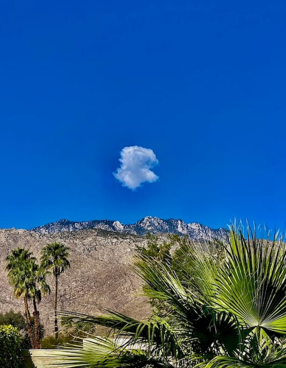
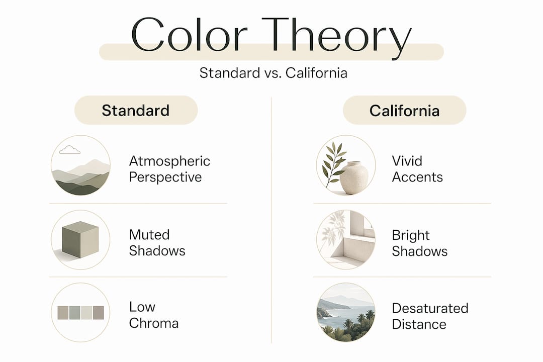
Color theory is universal in principle, but California bends it. The state’s atmosphere, its marine layer, its desert haze, and its relentless sun create conditions that push artists toward specific technical choices that textbook color theory does not fully anticipate.
Strong color use controls perception, space, mood, and symbolic meaning in art. In California, that control takes a regional shape. Here is how the core principles play out differently here:
| Color principle | Standard application | California adaptation |
|---|---|---|
| Atmospheric perspective | Colors cool and desaturate with distance | California haze intensifies this effect, requiring deeper desaturation |
| Saturation | High chroma draws the eye forward | Vibrant accents used sparingly to mimic sunlit highlights against muted backgrounds |
| Color temperature | Warm advances, cool recedes | Coastal fog creates cool midtones that compress space in unexpected ways |
| Harmony | Complementary or analogous schemes | California artists often break harmony rules to capture the jarring contrast of desert meets ocean |
California’s intense atmospheric light leads successful plein air painters to desaturate distant landscapes and use high-chroma accents sparingly, mimicking the way haze and sunlight actually interact in this environment. This is not a stylistic preference. It is an accurate response to what the eye actually sees standing in a California field at noon.
Pro Tip: If you are painting or analyzing California-inspired work, pay attention to the midtones. The drama in California art rarely lives in the darks or the lights. It lives in the subtle, atmospheric middle ground where the haze begins.
Color as cultural identity
Contemporary California art carries the weight of the state’s multicultural identity, and color is how that weight gets expressed. This is where the influence of color in painting becomes something more than a technical conversation.
The Chicano art movement is one of the clearest examples. Murals across East Los Angeles and the Central Valley use saturated reds, deep blacks, brilliant yellows, and sacred blues drawn from pre-Columbian and Mexican folk traditions. These are not arbitrary choices. The Chicano art exhibition “We the People: Chicano Art in the U.S.A.” at The Cheech Marin Center, featuring 126 works by 61 artists, demonstrates just how deliberately color functions as cultural code in this tradition.
Contemporary artists like Lakshmi Shankarreddy extend this conversation into South Asian immigrant experience. Her work uses color impressionistically to bridge multicultural identities, translating memories of India and California into emotional landscape impressions where hue carries the feeling of a specific place and time.
What makes California’s color symbolism so rich:
-
Memory encoded in palette: Warm terracottas and turmeric yellows can signal South Asian heritage; the same ochre reads as desert California to another viewer. The layering is intentional.
-
Political color: Chicano muralists used red and black with deliberate reference to labor movement iconography and indigenous symbolism.
-
Color as belonging: For immigrant artists, painting in the colors of both their origin and their adopted state is a way of claiming both without erasing either.
-
Emotional resonance beyond literal depiction: Color and emotion in artwork become inseparable when the palette itself tells the story of displacement, memory, and arrival.
Applying color understanding to your practice
Whether you are studying California art or creating work inspired by it, there are concrete ways to deepen your engagement with color. These steps move from observation to application.
-
Start with light, not color. Before identifying the hues in a California painting, identify the quality of light. Is it coastal gray morning light or inland afternoon gold? The light source determines every color decision that follows.
-
Read the shadows. Shadow color reveals the artist’s understanding of reflected light and ambient atmosphere. Cool violet shadows in a warm landscape tell you the artist was working outdoors in California sun.
-
Notice what is desaturated. California artists like Meredith Brooks Abbott use intuitive color mixtures to convey local light moods like Carpinteria sunlight and coastal fog. The muted passages are as deliberate as the bright ones.
-
Balance theory with feeling. California plein air artists prioritize intuitive color choices that capture emotional mood over literal accuracy. Let the theory inform you, then trust what you see.
-
Study the cultural context. When you look at a Chicano mural or a South Asian California landscape, research the color traditions the artist is drawing from. The palette is a text you can learn to read.
Color in California art and contemporary decor
The vibrant colors in California art do not stay in galleries. They move into homes, into textiles, into the wall above your sofa. The warm terracottas of a desert sunrise, the moody blues of a Venice Beach evening, the golden wash of a Central Coast sunset. These palettes have become a design language that speaks to anyone who has ever felt the pull of California light.
For art enthusiasts who want to bring that language home, the artistic color choices California artists have refined over a century are now accessible through photography-based wall art that captures the same atmospheric qualities. You can explore eclectic living room decor ideas that pair California-inspired color palettes with collected, story-driven spaces. The connection between fine art color traditions and everyday design is not a stretch. It is a direct line.
Our take on color as California’s true voice
We have spent a lot of time thinking about what makes California art feel different from art made anywhere else in the world, and the answer keeps coming back to color. Not just the brightness of it, though that is real. It is the specificity of it.
What we find most striking is how California artists, across every era and cultural background, use color to say something that words cannot. The Impressionists were saying: " This light is ours. The Chicano muralists were saying: " This history is ours. Lakshmi Shankarreddy is saying: both of these places live in me. Color is the common language across all of it.
The mistake most people make when looking at California art is treating the palette as a mood board. It is not. It is a position. When you start reading it that way, every painting opens up.
— Info
Bring California’s color legacy home
California’s art tradition is one of the most color-rich in the world, and Calicuration was built to carry that tradition into everyday spaces.
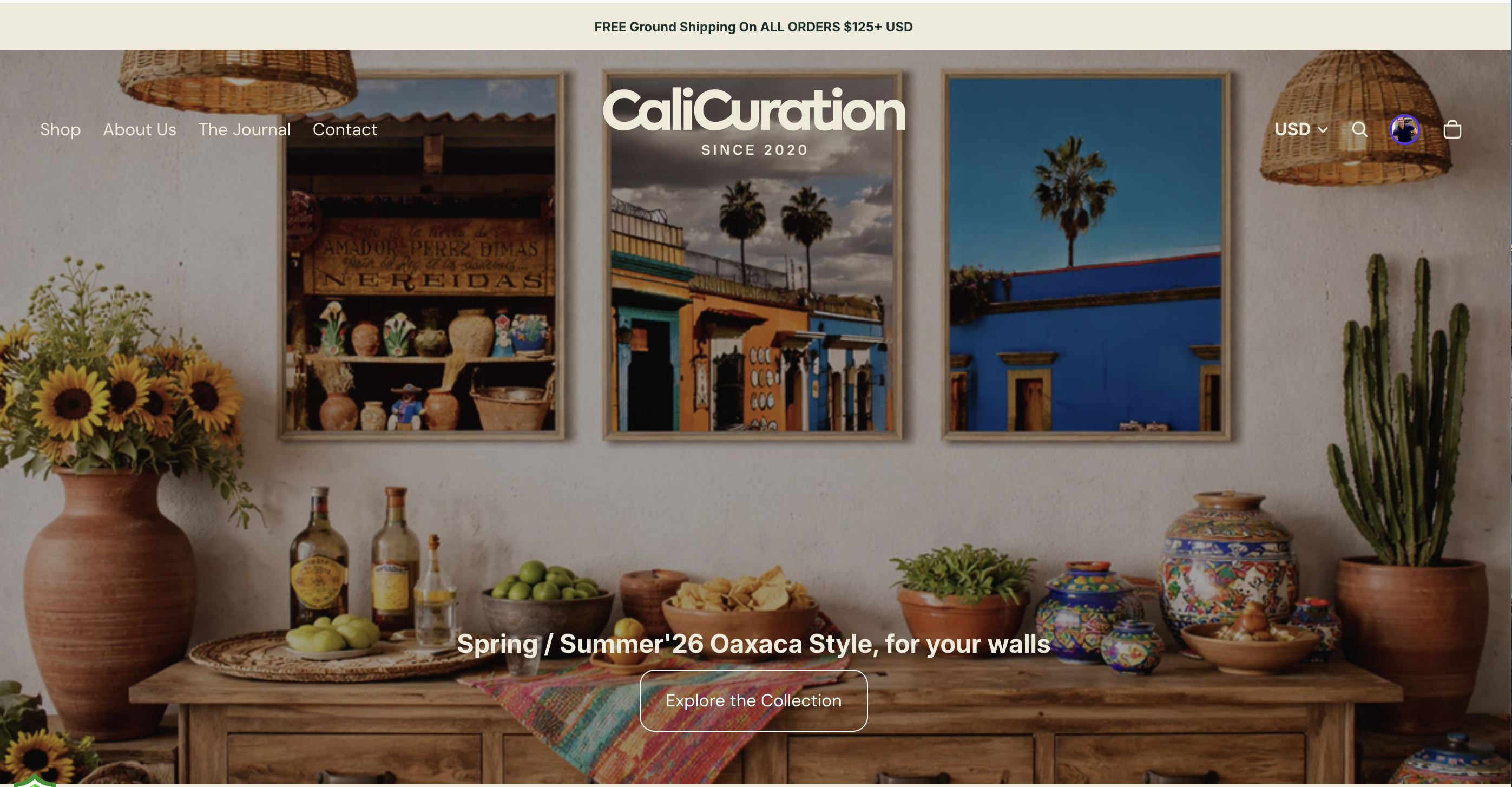
Every piece in the Calicuration collection is shot by the founder on location across California, from moody Venice Beach evenings to golden Central Coast sunsets. The colors you see are not filtered or fabricated. They are the real atmospheric light that California artists have been chasing for over a century. Browse the full California wall art collection to find a piece that carries the palette of a place you love. For something with deep coastal mood, the Venice Beach canvas print captures that blue-gray dusk light that California painters have always returned to. Each order is custom-produced, and 5% supports community impact in Los Angeles and New York City.
FAQ
What is the role of color in California art?
Color in California art functions as a primary expressive tool, conveying mood, cultural identity, and atmospheric truth rather than simply describing a scene. Artists across California’s movements have used specific palettes to communicate regional light, emotional experience, and cultural heritage.
How does California’s light affect artistic color choices?
California’s intense sunlight and coastal haze push artists to desaturate distant elements and use high-chroma accents sparingly, creating a regional adaptation of atmospheric perspective that is distinct from standard color theory practice.
How do California artists use color to express cultural identity?
Chicano muralists use saturated reds, blacks, and yellows drawn from pre-Columbian and Mexican folk traditions as cultural code, while contemporary artists like Lakshmi Shankarreddy use impressionistic color to translate immigrant memory and multicultural identity into landscape.
What California art movements are most significant for color?
California Impressionism and California Scene Painting are the foundational movements, with the latter transforming watercolor into a bold primary medium using wet-on-wet techniques and vibrant palettes from the 1920s onward.
How can students apply color theory to California art?
Start by identifying the light source and reading shadow colors, then study what is deliberately desaturated. Balancing formal color theory with intuitive atmospheric observation is the approach most California plein air artists use in practice.