

Last Updated: October 22, 2026
Quick Summary
Photography art is imagery captured through a camera lens and reproduced as a print, while a traditional painting is a handmade original or a reproduction of one. Choose photography for calm, realism, and a sense of place, or a painting for expression, texture, and a collected feel. For most homes, blending a large photographic anchor piece with one or two smaller paintings gives you both.
- Photographic prints are smooth by design, so your chosen finish becomes the texture.
- Hang art so the center sits roughly 57 to 60 inches from the floor.
- Cover roughly two-thirds to three-quarters of the width of the furniture below the art.
- Keep frame finishes to two at most on a gallery wall so it reads as intention.
- Compare total cost including artwork, framing, and installation, not the sticker alone.
Table of Contents
- Photography Art vs. Paintings: The Core Differences
- How to Choose Wall Art for Your Home
- Does Artwork Have to Match Decor? Style Compatibility Explained
- Mixing Photography and Paintings in a Gallery Wall
- Large Landscape Photography Prints for Living Room Impact
- Cost, Materials, and Care: A Like-for-Like Comparison
- Making the Final Choice: A Decision Framework
- Frequently Asked Questions
Photography Art vs. Paintings: The Core Differences
Photography art is imagery captured through a camera lens and reproduced as a print, while a traditional painting is a handmade original or a reproduction of one. That difference in origin shapes texture, cost, emotional register, and how each piece lives on your wall. At CaliCuration, every print begins as an original photograph taken by our founder on real travels, never staged, never stock, never AI-generated.
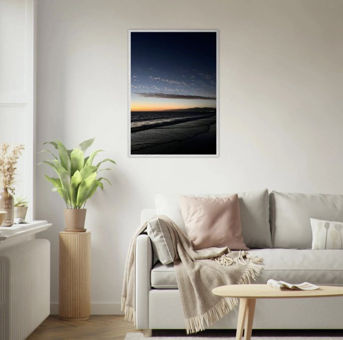
The practical split comes down to intent. A painting carries the visible hand of an artist; a photographic print carries a captured moment, light that actually fell on a real place at a real time. Neither is superior, they do different emotional work.
The Emotional and Visual Impact
Paintings feel expressive and interpretive: a landscape painting shows how an artist saw a place, with color pushed and detail softened to serve a mood. Photography shows you the place itself, which is why a large landscape photograph often reads as a window rather than a composition.
Photographic prints bring calm and realism, especially in coastal, desert, and city scenes where light does the emotional work. Paintings bring drama and personality, particularly abstract or boldly colored work. For a serene, open room, photography usually wins; for a collected, expressive one, a painting earns its place.
Texture, Surface, and Composition
Texture is where these two forms diverge most in person. Paintings have surface: canvas weave, impasto, visible strokes that change as light moves across the room. Photographic prints are smooth by design, and the finish you choose becomes the texture.
- Framed paper prints feel classic and gallery-like, with a mat and frame doing the visual framing
- Canvas prints soften detail slightly and suit relaxed, coastal spaces
- Metal and aluminum prints add a subtle sheen and suit modern, minimalist rooms
- Original paintings carry physical depth no print can replicate
Composition works differently too. Photographers compose in-camera, often around a single decisive moment. Painters can rearrange, exaggerate, and omit. A photograph's composition is fixed and honest; a painting's is deliberate and edited.
How to Choose Wall Art for Your Home
Choosing wall art starts with three questions: what mood the room needs, what scale the wall demands, and what you want the piece to say about you. Answer those before you browse, and the choice gets much simpler.
Start with the room's job. A living room usually wants a focal piece that anchors seating. A bedroom wants something quieter. A hallway can handle a bolder statement because nobody lingers there. Then measure the wall honestly.
Finally, decide what you want to feel when you walk past it. A travel photograph of a coastline you have visited carries memory; a painting chosen for its color carries atmosphere. Both are valid reasons to buy, and knowing yours keeps you from second-guessing later.
Does Artwork Have to Match Decor? Style Compatibility Explained
No, artwork does not have to match your decor, and forcing it to is one of the most common decorating mistakes.
Living room. Scale does the most work here.
Bedroom. Quieter wins here. Soft coastal or desert photography in warm or neutral tones keeps the room calm, while a smaller painting adds a personal note without dominating.
Dining room. This room can handle more color and personality. A vivid abstract painting or a saturated landscape photograph gives the table a focal point and can echo the room's palette without matching it exactly.
Hallway. Nobody lingers, so a bolder statement works, a strong photographic print or a pair of smaller paintings that carry the eye along the wall. Keep frames consistent so the run reads as one composition.
Two practical rules make compatibility easier to judge. First, check the light before you commit: a glossy framed print opposite a bright window will glare, while a matte canvas or aluminum print handles strong light more gracefully. Second, if a piece makes you pause and feels slightly unexpected but not jarring, it is probably right.
Mixing Photography and Paintings in a Gallery Wall
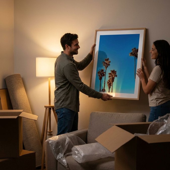
Mixing photography and paintings in a gallery wall works when you treat the arrangement as one composition rather than a collection of separate pieces.
Start with the largest piece, usually a landscape photograph or a statement painting, and place it slightly off-center. Build outward with smaller pieces, alternating photographs and paintings so neither type dominates. Keep frame finishes to two at most: six read as clutter, two read as intention.
Spacing matters as much as the pieces. Leave two to three inches between frames so each work breathes, and lay the whole arrangement out on the floor first, what looks balanced there usually looks balanced on the wall.
Large Landscape Photography Prints for Living Room Impact
Large landscape photography prints are the fastest way to give a living room a focal point without adding furniture. A single oversized print above a sofa does more than a cluster of small frames, because scale creates the sense of a window into somewhere else.
The appeal is emotional as much as visual. A large coastal or canyon photograph pulls the eye across the room and gives it somewhere to rest, and it makes a space feel bigger because the image reads as depth rather than decoration.
Our Malibu Canyon Wildflower Framed Poster is built for exactly this. The spring bloom fills a wide wall with color and natural California charm, and it works in a bright living room without competing with the furniture.

Cost, Materials, and Care: A Like-for-Like Comparison
The price gap between photography and painting is real, but it comes from what you are actually buying.
That is why a like-for-like comparison has to separate four things: the artwork itself, the edition, the framing and glazing, and the installation.
Factor |
Photographic Prints |
Traditional Paintings |
|---|---|---|
What drives price |
Image, print material, finish, framing, edition size |
Artist time, materials, originality, reputation |
Editioning |
Open edition or limited edition (numbered) |
One of a kind; reproductions may be sold separately |
Typical materials |
Archival paper, canvas, aluminum, acrylic face-mount |
Canvas or panel with paint, sometimes varnish |
Framing and glazing |
Often framed behind glass or acrylic; metal prints need no glazing |
Usually framed without glazing, or gallery-wrapped |
Durability |
Long-lived when archival and kept out of direct sun |
Long-lived with stable humidity and no direct sun |
Fading risk |
Real if printed on non-archival paper or hung in sun |
Lower, but pigments can shift over decades |
Humidity sensitivity |
Paper and canvas can ripple or mold in damp rooms |
Canvas can sag; paint can crack with extreme swings |
Cleaning |
Dry cloth on frame and glazing; never spray the print |
Dry, soft brush only; no liquid cleaners |
Reproducibility |
Can be reprinted in other sizes (open editions) |
Cannot be reproduced as the same object |
On the painting side, varnish protects the surface but can yellow with age, and humidity swings are the real enemy, a bathroom wall or a spot above a radiator is a poor home for either medium.
One more distinction affects both cost and value: original versus reproduction versus limited edition. An original painting is the only true one-of-a-kind.
At CaliCuration, our framed posters start at $59, with larger aluminum prints at the top of the range.
Making the Final Choice: A Decision Framework
The right choice comes down to four priorities: mood, budget, wall scale, and how much you value originality. Run your situation through this framework and the answer usually surfaces fast.
- If you want calm, realism, and a sense of place: choose photography art, especially large landscape prints
- If you want expression, texture, and a collected feel: choose a painting
- If you have a large wall and a moderate budget: a large photographic print gives the most impact per dollar
- If you want a one-of-a-kind piece: an original painting is the only true answer
- If you want both: mix them on one gallery wall with a shared color thread
For most homes, the honest answer is a blend. A large photographic anchor piece with one or two smaller paintings around it gives you realism and expression in the same room. That combination tends to age better than committing entirely to one form.
The hardest part of choosing wall art is not the comparison itself. It is trusting that a piece you love will work in your space. Explore our framed travel prints and find the moment you want to live with.

Frequently Asked Questions
Is photography considered fine art?
Yes, photography is widely recognized as fine art. The distinction lies in the artist's intent and the work's quality. A fine art photograph is created as a piece of art, often printed in limited editions on high-quality paper, just like a painting or sculpture. It involves a high level of skill in composition, lighting, and post-processing. When you choose photography art for your home, you are acquiring an original creative work, not just a decorative image.
Can I mix photography and paintings in the same room?
Absolutely. Mixing photography and paintings is a great way to create a layered, personal space. The key is to find a common thread to tie them together. This could be a shared color palette, a consistent style of frame, or a recurring theme like landscapes or city scenes. You can also create a gallery wall that intentionally mixes the two mediums for a dynamic, collected look. Start with one anchor piece and build around it.
Does artwork have to match my decor?
Artwork does not have to match your decor perfectly, but it should feel intentional. A piece can either harmonize with your room's color palette and style or serve as a deliberate contrast. The most important factor is that you love the art. If you choose a piece that resonates with you, it will naturally find its place in your home. Use your decor as a guide, not a strict rulebook, and let your personal taste lead the way.
How do I choose the right size art for my wall?
A good rule of thumb is that art should cover about 60-75% of the available wall space above a piece of furniture. For a large empty wall, a single large statement piece, like a large landscape photography print, can anchor the room. For smaller spaces, a grouping of smaller pieces can work well. Always measure your space before you buy and use painter's tape to map out the dimensions on your wall to see how it feels.
What is the 70/30 rule in art?
The 70/30 rule is a guideline for creating balance in a room's design. It suggests that 70% of your decor should follow a consistent style or theme, while the remaining 30% can be used to introduce contrasting elements. For art, this means most of your pieces might share a similar aesthetic, but you can add a few contrasting pieces for visual interest. This could mean mixing a few abstract paintings into a collection of photography art.