

If you’ve ever walked into a room and felt like the wall art could belong in a hotel lobby, you already understand why it matters to avoid generic California wall decor. Mass-produced “Golden State” prints and “Good Vibes Only” signs are everywhere, and they say nothing real about the person who hung them. Your walls can do better. They can read like a memory map: specific, warm, and entirely yours. This guide walks you through recognizing the pitfalls, planning with intention, and choosing California themed artwork that actually means something.
Table of Contents
Key takeaways
| Point | Details |
|---|---|
| Recognize clichéd patterns | Slogan prints and mass-produced canvases create spaces that feel uninspired and interchangeable. |
| Plan before you hang | Treat a gallery wall as one composition sized to your furniture for a cohesive, intentional look. |
| Choose story-driven art | Prioritize pieces with a genuine California narrative rather than anything that fits a generic “beach house” mold. |
| Unify your framing | Keep one constant element like frame finish or mat color to make mixed styles feel collected, not scattered. |
| Light your art with care | Directional lighting at the right angle transforms good art from flat to engaging and vibrant. |
How to avoid generic California wall decor: spot the pitfalls first
The design term here is “filler art,” and California decor has more than its share of it. Before you can make better choices, you need to recognize what makes a piece generic in the first place.
The biggest culprits show up in predictable forms:
-
Cheesy typography and random slogans. “Sunset State of Mind.” “California Dreamin’.” Design expert Emily Henderson specifically flags bad typography and random quotes as top offenders in generic decor. If the phrase could appear on a mug in a gift shop, it does not belong on your wall.
-
Mass-produced abstract prints. These look like art, but pieces without distinct narratives or real compositional intention feel like filler. They fill space without adding meaning.
-
Canvas-wrapped prints from bulk retailers. The stretcher bar format and generic subject matter make these feel manufactured. If you could swap the piece into any room in any city without changing the feeling of the space, it fails the uniqueness test.
-
Obvious subjects shot obviously. A generic sunset over the Pacific, palm trees against a blue sky, a Hollywood sign silhouette. These images are real, but artwork that could be swapped into any room without changing its meaning has no personal connection to you or your story.
Pro Tip: Hold up a piece and ask yourself: “Would this fit equally well in a doctor’s waiting room?” If the answer is yes, keep looking.
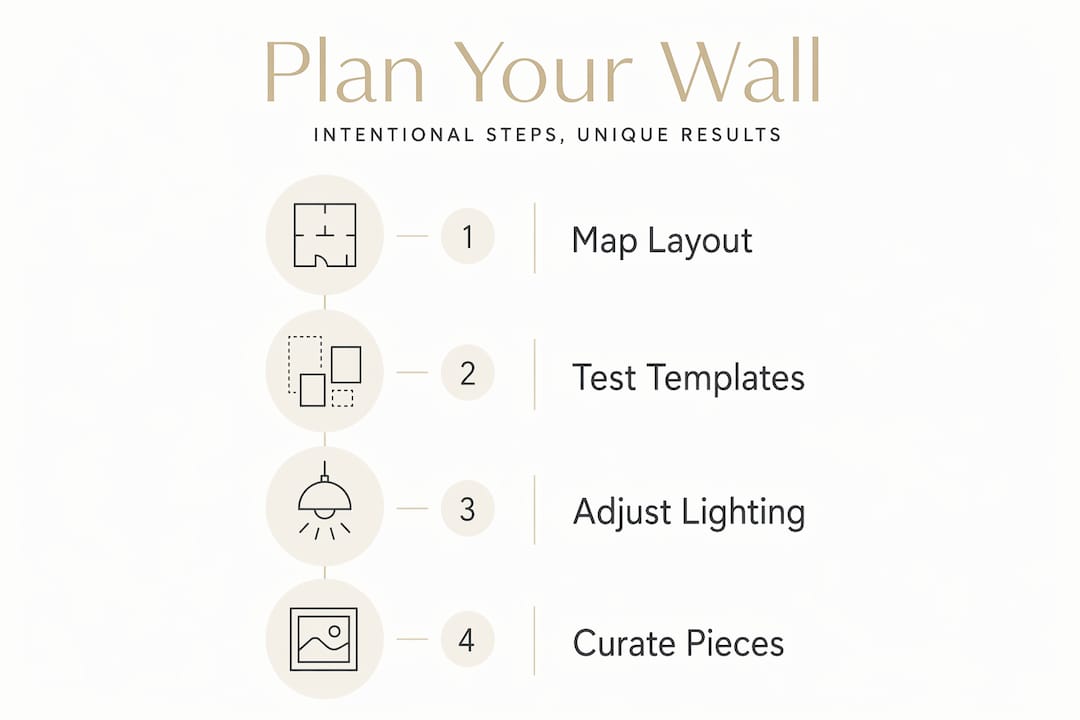
Planning your wall display with intention
Once you know what to avoid, preparation becomes the most important step. A thoughtful layout transforms a collection of pieces into a single, considered composition. Think of it like arranging a playlist. The individual songs matter, but the order and the feeling of the whole is what stays with you.
Follow these steps before a single nail goes into the wall:
-
Size the gallery to your furniture. A gallery wall should read as one art piece sized to roughly two-thirds the width of the sofa, console, or bed it anchors. Going wider creates imbalance; going narrower looks timid.
-
Set your spacing early. Spacing of 2 to 3 inches between frames gives a crisp, curated feel. Tighter starts to look crowded; wider starts to look random.
-
Plan your layout on the floor first. Cut paper templates and tape them to the wall before hanging. This prevents unnecessary holes and lets you see the composition clearly before committing.
-
Choose a unifying thread. This could be frame finish, mat color, or art style. Mixing frame styles works beautifully when one constant element holds everything together. Without that anchor, the wall looks accumulated rather than collected.
-
Mix your art types. Combining photography, woven textiles, and three-dimensional objects creates the layered, tactile feeling that mass-produced sets can never replicate.
Here is a quick reference for frame depth by space type:
| Space type | Recommended frame depth | Notes |
|---|---|---|
| Narrow hallway | Under 1.5 inches | Deep frames create clutter and obstruct movement |
| Open living room | 1.5 to 2.5 inches | More depth adds dimension without crowding |
| Bedroom wall | 1 to 2 inches | Subtle depth keeps the atmosphere restful |
Pro Tip: Cut kraft paper templates of each piece, tape them to the wall with painter’s tape, and live with the layout for a day before hanging. What looks balanced in the morning can feel off by afternoon light.
Selecting California wall art that tells your story
This is where personalized home decor solutions separate themselves from anything you could grab off a shelf. The goal is not California as a concept. It is your California. The stretch of coast where you stopped the car. The desert light at that particular hour. The city glow from a rooftop you remember.
When choosing pieces, keep these principles in mind:
-
Prioritize real narratives. Wall art feels personal when it tells a story about the person who chose it, not just the scene it captures. A photograph from a specific, remembered place carries more weight than a generic beach print.
-
Support working artists or limited editions. Intentionality separates unique California wall art from “hotel lobby” decor. Buying from artists who have a genuine point of view means your wall reflects a real creative voice.
-
Avoid the obvious California subjects. Hollywood sign, generic PCH sunset, palms against blue sky. These are real places, but they are also the most mass-produced images in the market. Seek out the unexpected angle, the mood, the offseason light.
-
Add texture through objects. A woven textile or a small shelf with a found object breaks the flatness of a purely photographic display and adds dimension that feels genuinely collected.
-
Rotate seasonally. Swap one or two pieces every few months to keep the wall feeling fresh and intentional rather than fixed and forgotten.
“Gallery walls succeed with intentional themes; randomness leads to a scattered, filler appearance.” — Modern Memory Design
Maintaining the look after installation
Hanging the art is not the final step. What happens after installation often determines whether a wall reads as curated or starts to feel cluttered and forgotten over time.
| Common mistake | Better approach |
|---|---|
| Direct overhead lighting | Angled directional light at approximately 30 degrees for color accuracy |
| Reflective glass facing a window | Position frames to avoid direct window opposition and reduce glare |
| Crowding a narrow hallway | Keep frames shallow and leave breathing space between pieces |
| Random frame and mat styles | Hold one element constant across all frames for visual cohesion |
| Overfilling every inch of wall | Embrace negative space. It signals confidence in what you chose to hang. |
Correct lighting transforms art from flat and generic to dynamic and engaging. General overhead fixtures cause glare and color distortion. What you mistake for a mediocre print is sometimes just a mediocre lighting setup. Use adjustable, directional LED fixtures with high color rendering for the truest result.
Pro Tip: Check your wall from sitting height, not standing. Most art gets viewed from a sofa or chair, so the lighting angle should account for that perspective.
Our perspective on why this matters
In our experience, the walls that move people are never the ones filled with the most art. They are the ones where every piece was chosen with some kind of reason. A print from a place someone loved. A photograph that captures a particular quality of light that the owner felt they had to hold onto.
We’ve watched clients reconsider entire collections after asking one simple question: “What does this piece say about where you have been or what you care about?” Generic California decor fails not because it’s California, but because it could be anywhere. The coast, the desert light, the city glow at golden hour: these are specific things. They deserve specific art.
There is also something to be said for imperfection. A gallery wall that includes one rough-edged print, one textile, one piece that breaks the grid is often more compelling than a perfectly symmetrical arrangement of identical frames. Personality lives in the choices that don’t quite follow the rules.
The emotional impact of your walls is worth the extra thought it takes to get there.
— Info
Bring your California story home with Calicuration
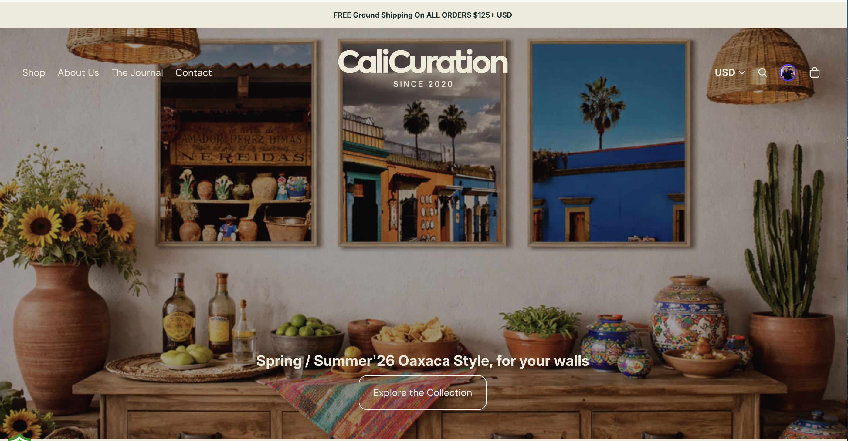
Calicuration was built on exactly this idea: that California wall art should carry a story, not just a subject. Every piece in the collection comes from original, founder-shot travel photography capturing coast, desert, city glow, and the quieter moments in between. Nothing is mass-produced. Each order is made on demand, so your print is created specifically for your space.
If you’re ready to move past generic prints and into something that actually reflects your version of California, explore the full California wall art collection at Calicuration. From moody Venice Beach canvases to Malibu canyon wildflowers in museum-quality frames, every piece is a genuine piece of the state. And 5% of every order supports community impact work in Los Angeles and New York City.
FAQ
What makes California wall decor feel generic?
Generic California decor typically relies on slogan typography, mass-produced abstract prints, or overused subjects like Hollywood signs and palm trees. Pieces that could fit any room without context are the clearest sign you’re looking at filler art.
How do I create a cohesive California gallery wall?
Plan the layout on the floor first, size the grouping to about two-thirds the width of your furniture, and keep spacing between frames at 2 to 3 inches. Choose one unifying element like frame finish or mat color to hold mixed styles together.
How does lighting affect my wall art display?
Glare and color distortion from general overhead fixtures can make even great art look flat. Use adjustable directional lighting aimed at roughly 30 degrees and avoid placing fixtures directly opposite reflective glass.
Is it better to buy from independent artists for unique wall decor?
Yes. Supporting real artists over mass-produced sets means your walls reflect a genuine creative point of view rather than a catalog selection. Limited editions and story-driven photography add personal meaning that a bulk print cannot replicate.
How often should I update my wall decor?
Rotating one or two pieces seasonally keeps a curated gallery feeling fresh without requiring a full redesign. It also gives you an ongoing reason to stay intentional about what you choose to display.