

Build a story-driven gallery wall by choosing a clear theme, anchoring it with a large focal piece, and arranging supporting works so the display reads like a visual sequence held together by one unifying thread. That single sentence is the whole method. Everything below shows you how to do it well.
Your core steps at a glance:
- Choose the story or theme your wall will tell
- Select a large anchor piece that carries the emotional weight
- Pick supporting works that advance the narrative
- Establish one unifying thread (color, frame style, or subject)
- Mix sizes, orientations, and media with intention
- Mock up the layout on the floor or with paper templates before drilling
- Hang using measured spacing and a level
- Add personal objects where they deepen the story
Pro Tip: Cut paper templates to the exact size of each frame and tape them to the wall before you touch a drill. Rearranging paper costs nothing; rearranging holes costs time and plaster.
Key Takeaways
A story-driven gallery wall succeeds when every decision, from theme to hardware, serves the narrative rather than just filling space.
| Point | Details |
|---|---|
| Theme first, art second | Choose the story before selecting any piece; a clear theme filters every decision that follows. |
| Anchor off-center | Place the largest, most emotionally weighted piece slightly off-center to keep the viewer’s eye moving. |
| Paper templates before drilling | Cut templates to exact frame sizes, tape them to the wall, and mark nail positions before any hardware goes in. |
| One unifying thread | Pick one element (frame color, palette, or subject) to hold an eclectic mix together without forcing uniformity. |
| Calicuration as a starting point | Calicuration’s on-demand, archival travel photography collections offer cohesive, story-ready prints for anchor and supporting pieces. |
Table of Contents
- What story do you want your wall to tell?
- How to choose an anchor piece and build around it
- What unifying thread will hold your wall together?
- Mixing sizes, orientations, and media with intention
- The no-fail hanging workflow: templates, spacing, and measurements
- How to arrange pieces so the wall reads like a story
- Which print materials and finishes suit your story?
- How to include personal objects without losing cohesion
- Common mistakes and how to fix them
- How we at Calicuration curate story-driven wall art
- Why story-led walls endure
- Start your story-driven wall with Calicuration
- Sources
What story do you want your wall to tell?
Every gallery wall starts with a question, not a hammer. Before you choose a single frame, ask yourself: What memory, place, or chapter of life do we want to feel every time we walk past this wall? That answer becomes your editorial filter for every piece you add or remove.
Common theme types that sustain a multi-piece display:
- Travel timeline: a sequence of places visited, arranged chronologically or geographically
- Family history: portraits, heirlooms, and documents that trace a lineage
- Passions and pursuits: surf, music, food, architecture, or any subject that defines how you spend your time
- Place-evocative series: prints that capture the mood of a single region, coast, or city
- Seasonal or tonal mood: a palette-driven collection that shifts from warm desert light to cool coastal fog
Once you have a theme in mind, run it through this quick decision check before committing:
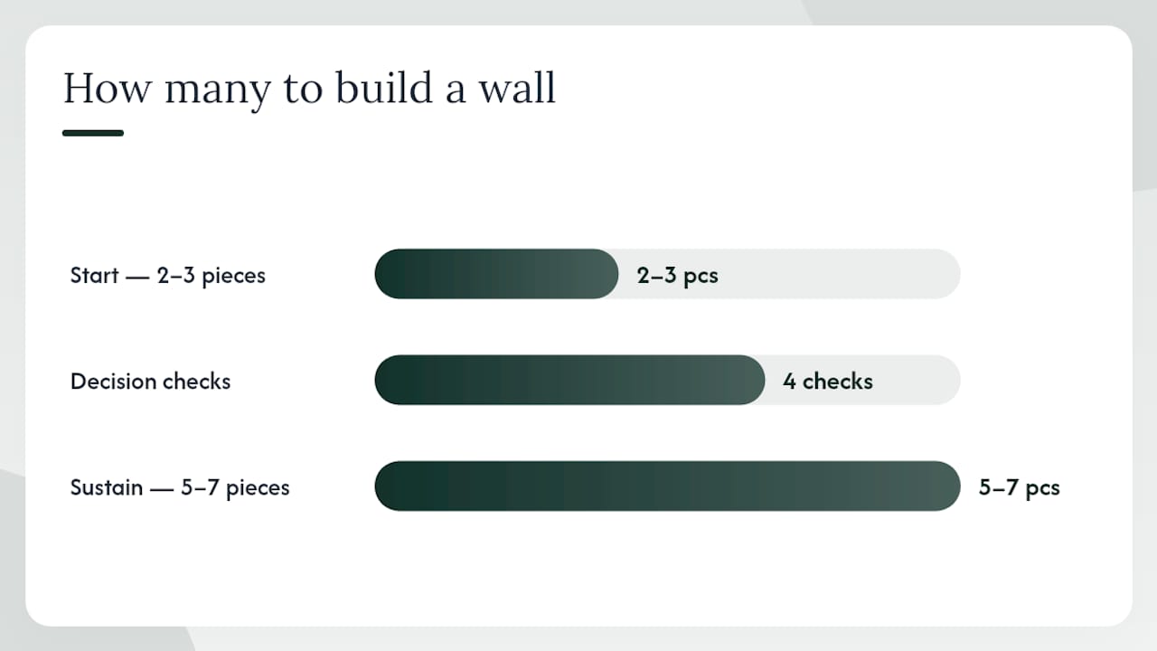
- Do you have at least five to seven images or objects that belong to this theme?
- Does the theme carry enough emotional resonance to hold your attention for years, not just months?
- Is there enough visual variety within the theme (different scales, orientations, tones) to keep the arrangement dynamic?
- Can the theme grow over time as you collect new pieces?
If you answered yes to all four, your theme will sustain a wall. If you hesitated on number two, dig deeper. A wall built around a trend fades; one built around a real memory does not. Starting with just two or three pieces you genuinely love and building the collection over time produces a more authentic result than buying a matched set all at once.
How to choose an anchor piece and build around it
The anchor is the piece that carries the story’s emotional center of gravity. Everything else orbits it.
Identifying your anchor
- Size: the anchor should be noticeably larger than any other piece, typically at least 18×24 inches for a standard living room wall.
- Subject strength: it should depict the clearest, most emotionally loaded moment in your theme.
- Visual weight: strong contrast, a bold horizon line, or a face draws the eye and holds it.
Selecting supporting pieces
Supporting works advance the story rather than repeat it. Think of them as chapters that follow the anchor’s opening scene.
- Vary the scale: pair one medium piece (11×14) with two smaller ones (5×7 or 8×10) on each side.
- Repeat a motif without duplicating it: if the anchor shows a coastline, a supporting piece might show sea grass, a harbor detail, or a weathered dock.
- Alternate orientations: a vertical anchor reads differently when flanked by horizontal pieces, creating visual tension that keeps the eye moving.
Anchor placement and its effect on narrative flow
Professional stylists recommend placing the anchor slightly off-center rather than dead-center. A centered anchor stops the eye; an off-center one invites it to keep traveling across the wall.
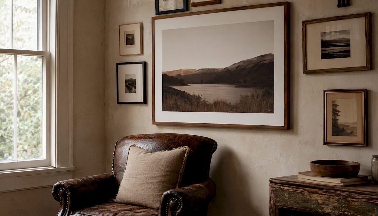
As a general rule, art should span roughly 2/3 to 3/4 the width of the furniture beneath it for the arrangement to feel visually anchored to the room rather than floating above it.
Pro Tip: Hang the anchor first, step back, and live with it for a day before adding anything else. You will see the negative space differently once the anchor is on the wall.
What unifying thread will hold your wall together?
An eclectic gallery wall does not need to match. It needs to agree. The difference is one deliberate thread running through every piece, giving the eye a reason to read the collection as a whole rather than a series of unrelated objects.
Your options for a unifying thread:
- Limited color palette: pull two or three colors from the anchor piece and let them recur across supporting works, frames, and any small objects.
- Consistent frame treatment: all black frames, all natural wood, or all frameless prints create visual rhythm even when the subjects vary widely.
- Recurring motif or subject: water, light, architecture, or a particular texture can appear in different forms across every piece.
- Color temperature: warm-toned prints (golden hour, amber desert light) feel cohesive together; mixing warm and cool tones without intention reads as accidental.
Stylists consistently advise choosing one unifying element rather than forcing total uniformity. That single thread is what lets you mix mediums, frame styles, and subjects while keeping the wall looking intentional rather than cluttered. Current design thinking favors exactly this collected, mix-and-match feeling, held together by just one or two anchoring decisions.
Pro Tip: If you are mixing metal finishes in the room, match at least one frame finish to the dominant metal in your hardware or lighting. That small repetition ties the wall to the room without any extra effort.
Mixing sizes, orientations, and media with intention
Scale is how you control emphasis. A wall of identically sized prints tells no story; it catalogs. Varying scale creates a visual rhythm that leads the eye from one piece to the next, pausing at the moments that matter most.
Practical patterns that work:
- Anchor plus diagonally-opposed secondary: place the largest piece upper-left and a medium secondary piece lower-right, then fill the space between with smaller works. The diagonal creates movement.
- Mini-grids inside a larger salon wall: group three or four small prints in a tight 2×2 grid and treat that cluster as a single “piece” within the larger arrangement. It adds structure without rigidity.
- Leaning versus mounted: a large canvas leaning against a shelf or console adds depth and a relaxed, collected quality that mounted-only walls can lack.
When it comes to media, the modern approach favors mixing prints, photographs, and objects rather than keeping everything in the same format. A framed photograph next to a small textile, a shadowbox, or a ceramic piece adds tactile variety that a flat wall of prints cannot replicate.
A gallery wall that mixes a salt-faded photograph, a hand-drawn map, and a small pressed botanical is not decorating. It is editing a life into a room.
Think of each medium as a different instrument in the same arrangement. Prints carry color and image. Textiles carry texture. Objects carry dimension. Used together, they create a wall that rewards a second and third look.
The no-fail hanging workflow: templates, spacing, and measurements
Fear of drilling is the most common reason a gallery wall never gets made. A paper-template workflow removes that fear entirely.
Step-by-step hanging process
- Measure the wall space and note the width of any furniture below it.
- Cut paper templates to the exact dimensions of each frame. Label each template with the piece it represents.
- Arrange templates on the floor first, shifting them until the layout feels right.
- Tape templates to the wall with painter’s tape. Professionals mark nail positions directly on the paper templates before drilling, so the template itself becomes the measuring guide.
- Mark through the template at each nail point, then remove the paper.
- Drill or insert hardware at the marked points.
- Hang each piece, level, and check the overall arrangement before removing the tape marks.
Key measurements to follow
| Measurement | Recommended guideline |
|---|---|
| Spacing between frames | 2–3 inches |
| Art width vs. furniture width | 2/3 to 3/4 of furniture width |
| Visual center height (no furniture) | 57 inches from floor |
| Bottom of art to furniture top | 4–8 inches |
Pro Tip: For renter-friendly installations, Command strips rated for the frame weight and adhesive picture-hanging strips work well for lighter pieces. For heavier canvas prints, look for damage-free wall anchors designed for plaster or drywall. Our rental apartment hanging guide covers damage-free options in detail.
Renter-friendly checklist before you hang:
- Confirm each piece’s weight against the adhesive strip’s rated capacity
- Use a level app on your phone rather than eyeballing
- Keep a small container of spackle and matching paint for any touch-ups at move-out
- Photograph the wall before and after installation
How to arrange pieces so the wall reads like a story
Visual storytelling uses composition, symbolism, and perspective to guide interpretation without a single word of caption. The same principles apply to a gallery wall. When you arrange pieces with narrative intent, a viewer’s eye moves through the display in a sequence you have designed.
Think of the wall in four beats:
- Entry point: the first piece the eye lands on, usually the anchor. It establishes the theme and emotional tone.
- Progression: supporting pieces that develop the story, introducing new subjects, scales, or moods.
- Climax: a single piece with the highest emotional charge, often placed slightly off-center or at the visual midpoint of the arrangement.
- Resolution: smaller, quieter pieces at the edges that let the eye rest and complete the circuit.
Artists and educators at the Getty describe two fundamental storytelling strategies: sequencing multiple images to show a progression, or presenting a single decisive scene that implies a larger narrative. Both work on a gallery wall. A travel-themed wall might sequence images chronologically; a family wall might center on one powerful portrait surrounded by quieter supporting details.
The Met’s collection of Chinese narrative painting demonstrates a third approach: using register-like sequences where each row or cluster reads as a separate chapter. You can adapt this by grouping pieces into loose clusters that each tell a micro-story within the larger wall.
Pro Tip: Place the anchor slightly off-center to keep the viewer’s eye moving. A centered anchor creates a symmetrical composition that resolves too quickly; an off-center one creates visual tension that pulls the eye across the full display.
Which print materials and finishes suit your story?
The material a print is produced on changes how the story feels, not just how it looks. A matte fine-art paper print reads differently than a canvas wrap or a metal print, even when the image is identical.
- Canvas wraps: warm, painterly texture that softens photographic detail. Works well for landscapes, travel, and organic subjects. Frameless edges suit casual, collected interiors.
- Framed paper prints: the most versatile option. A white mat and a thin black or natural wood frame suits almost any subject and keeps the focus on the image. Archival paper with acid-free mats protects the print from yellowing for decades.
- Metal or aluminum prints: high contrast, vivid color, and a slight sheen. Best for architectural subjects, cityscapes, and images where graphic clarity matters more than warmth.
- Acrylic face mounts: the most luminous finish, with depth and color saturation that no paper print can match. Suited to bold, graphic anchor pieces where visual impact is the priority.
Lighting and finish interact directly. Gloss and metallic finishes pick up ambient light and can create glare under overhead fixtures. Matte and satin finishes absorb light more evenly and tend to read better in rooms with mixed or directional lighting. Warm-toned bulbs (2700–3000K) deepen the amber and earth tones in travel photography; cooler bulbs (4000K and above) flatten them.
Pro Tip: When ordering prints for a single wall, keep the finish consistent across all pieces. Mixing matte and gloss prints on the same wall creates an unintentional visual inconsistency that is hard to fix without reprinting.
For material comparisons and ordering options, Calicuration’s wall art by material collection covers canvas, framed, and aluminum prints side by side.
How to include personal objects without losing cohesion
The most memorable gallery walls hold something no print shop can produce: a ticket stub from a concert that changed everything, a grandmother’s embroidered handkerchief, a pressed flower from a trail you hiked on your honeymoon. These objects are the wall’s heartbeat.
Ideas for personal items that integrate well:
- Ticket stubs, postcards, and handwritten notes in small clip frames or float mounts
- Pressed botanicals under UV-protective glass
- Small shelves holding a single object (a ceramic, a stone, a found shell)
- Textiles pinned or stretched in a simple frame
- Shadowboxes for three-dimensional items like medals, keys, or folded maps
Framing fragile or unusual items
- Use a shadowbox with UV-protective glazing for anything light-sensitive (fabric, paper, pressed plants).
- Float-mount flat items on a contrasting mat so the object appears to hover rather than sit on a background.
- For very fragile textiles, consult a framer about archival mounting tissue rather than adhesive.
The key to keeping personal objects from cluttering the story is restraint. Limit small-format personal items to two or three key moments in the arrangement, placed where they add emotional punctuation rather than visual noise. One ticket stub tucked beside a travel photograph says everything; seven of them scattered across the wall say nothing clearly.
Common mistakes and how to fix them
Even a well-chosen collection can fall flat if the execution misses a few fundamentals. Here are the pitfalls we see most often, and the quick corrections for each.
Frequent mistakes:
- Art that is too small for the wall or the furniture beneath it
- Inconsistent spacing that makes the arrangement look accidental
- No clear focal point, so the eye wanders without landing anywhere
- Ignoring lighting, leaving pieces in shadow or washed out by glare
- Mixing too many unifying threads until none of them read
Quick fixes
- Too-small art: measure the furniture width and apply the 2/3 to 3/4 rule before ordering. If existing pieces are too small, group them into a tight cluster that reads as a single larger piece.
- Inconsistent spacing: re-tape paper templates and use a ruler to confirm 2–3 inches between every frame before re-hanging.
- No focal point: identify the single piece with the most emotional weight and move it to the visual center or slightly off-center. Remove any piece that competes with it for attention.
- Poor lighting: add a picture light, a directional track light, or a floor lamp aimed at the wall. Warm directional light at a 30-degree angle from the wall surface brings out texture and depth.
- Evolving the wall over time: swap one piece at a time rather than replacing the whole arrangement. Keep the anchor and the unifying thread in place; rotate supporting pieces as your story grows.
How we at Calicuration curate story-driven wall art
Every collection we build at Calicuration starts the same way a good gallery wall does: with a place and a feeling. Our founder shoots every image, which means each print carries a specific memory of light, air, and geography rather than a generic stock aesthetic. A coastal California series might move from open Pacific horizon to tide pool detail to the warm amber of a cliff-side road at dusk. That sequence is a story. Place-evocative photography like this gives a gallery wall a coherent emotional thread before you hang a single frame.
Our canvas prints work particularly well as anchor pieces. The texture softens the photographic detail in a way that reads as warm and collected rather than clinical. Framed paper prints, produced on archival stock with acid-free mats, suit supporting pieces where you want the image to breathe inside a clean border.
Every piece we produce is made on demand, which means nothing sits in a warehouse waiting to be relevant. It is made for your wall, your story, your room.
Every order is produced on demand, printed on archival materials, and ships with 5% of the sale supporting community impact efforts in Los Angeles and New York City. For readers who want a cohesive set of story-ready prints without sourcing multiple artists, Calicuration’s travel photography collections offer a practical starting point.
Pro Tip: Start with one large canvas anchor from a collection you love, then add framed prints in smaller sizes from the same series. The shared light quality and palette do the unifying work for you.
Why story-led walls endure
We have seen a lot of gallery walls. The ones that age well share one quality: they were never really about decoration. They were about the people who made them, the places those people had been, and the objects that carried weight from one chapter of life into the next.
A wall built around a trend looks dated within a few years. A wall built around a memory of the Sonoran Desert at sunrise, or a grandmother’s handwriting, or the particular blue of the Pacific on a January morning, only deepens with time. The role of wall art in identity and self-expression is not decorative in the shallow sense. It is archival. It is the home as a memory map.
We also believe that a story-led wall should be treated as a living display, not a finished project. Swap one piece when you return from a trip. Add a small object when something meaningful arrives in your life. Let the wall grow the way a good bookshelf grows: slowly, deliberately, and always in the direction of meaning.
Start your story-driven wall with Calicuration
The clearest first step is also the most satisfying one: choose a single anchor print that captures a place or moment that genuinely matters to you. From there, the rest of the wall tends to find its own shape.
Calicuration’s canvas wall art collection is built for exactly this kind of beginning. Every piece is founder-shot, produced on demand on archival materials, and part of a place-evocative series designed to work together. If you are drawn to the California coast, the desert interior, or the warm glow of a city at dusk, there is a collection that already tells that story. Browse the full wall art collection to find the anchor piece your wall has been waiting for, and know that 5% of every order goes directly to community impact efforts in Los Angeles and New York City.
Sources
These are the sources and references that shaped this guide, each useful for a different part of the process:
- Narrative Art | National Museum of Women in the Arts
- Telling Stories in Art (Education at the Getty)
- How To Actually Make A Gallery Wall: Our No-Fail Formula We Use Every Time (+ Our Favorite Original Art Resources) - Emily Henderson
- How to plan a gallery wall layout (WallMockup)
- How to Create the Perfect Gallery Wall: Complete Guide
- Gallery wall ideas and how to make one — Southern Living
- Show and Tell: Storytelling in Chinese Painting — The Met