

California mood board wall art examples are curated collections of imagery, texture, and color that translate the state’s coastal and modern spirit into a living space. A mood board, in design terms, is a visual tool made of curated imagery and textures that sets the direction for a room’s feel before a single nail goes in the wall. California’s design identity sits at the intersection of salt air and clean lines, warm wood and open sky. The examples we explore here range from modular wood panel systems to abstract coastal photography, giving you a clear path from inspiration to installation.
1. What makes California mood board wall art examples work
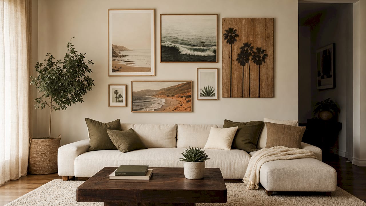
The best California mood board wall art examples share three qualities: a restrained palette, tactile materials, and a sense of place. They do not shout “beach house.” They whisper it. Think soft sand tones, warm whites, and the occasional deep ocean blue placed with intention. These pieces feel collected over time, like a memory map of places you have loved, rather than a single shopping trip.
The design principle at work is visual cohesion. Each piece on your wall should feel like it belongs to the same quiet story. When that story is California, the imagery leans toward coast, canyon, and city glow, never toward literal anchors or cartoon waves.
2. Modular art systems for flexible California gallery walls
Modular art systems are the most practical format for building a California mood board on your wall. Multi-panel wood systems use nine square panels of half-inch engineered wood with maple veneer, available in configurations from 3’ x 3’ to 5’ x 5’ and weighing between 14 and 39 lbs. That range of sizes means you can fill a narrow hallway or anchor an entire living room wall with the same system.
The real advantage is flexibility. You can rearrange the panels until the layout feels right, then commit. Key features to look for:
- Custom configurations: Panels that separate and reconnect let you shift the composition as your taste evolves.
- Lightweight materials: Engineered wood with maple veneer keeps weight manageable without sacrificing warmth.
- Easy mounting: Paper hanging templates and keyhole mounts simplify installation and encourage you to experiment before drilling.
- Scalable sizing: Starting at 3’ x 3’ means even a small apartment wall can hold a full mood board composition.
| Feature | Benefit |
|---|---|
| Nine-panel configuration | Allows asymmetric or grid layouts |
| Maple veneer surface | Adds natural warmth and texture |
| Keyhole mount hardware | Simplifies leveling and repositioning |
| Paper hanging template | Reduces wall damage during placement |
Pro Tip: Lay your panels on the floor first and photograph the arrangement from above. That photo becomes your installation guide and saves you from extra holes in the wall.
3. How to use coastal photography and abstract art for California vibes
Modern coastal art is defined by tone-on-tone palettes, sophisticated abstractions, and textured canvases or muted photography that maintain a calm indoor-outdoor flow. This is the opposite of a bright turquoise wave print. The goal is a room that feels like the light just after sunrise on a Pacific beach, not a souvenir shop.
“The best coastal interiors avoid overly literal decor like anchors or seashell prints, favoring subtle, modernized pieces to keep the space stylish rather than themed.” The most effective California coastal wall art uses abstract ocean-inspired imagery, landscape prints in muted tones, and oversized framed pieces that anchor the room without overwhelming it.
When selecting photography or abstract art for your California mood board, focus on:
- Tone-on-tone palettes: Soft blues layered with cream and warm sand tones create depth without contrast overload.
- Muted photography: A moody Venice Beach print captures the city’s gritty warmth without feeling like a postcard.
- Textured canvases: A canvas with visible grain or brushwork adds a tactile quality that flat prints cannot replicate.
- Abstract shorelines: Shapes that suggest water and light without depicting them literally keep the look sophisticated.
4. Incorporating boho and natural elements for a relaxed California feel
The boho California aesthetic is not about clutter. It is about layering organic materials with intention. Design expert Jackie recommends restrained layering of linens and woods to create a considered coastal look that avoids mass-market seaside clichés. The key word is “restrained.” One rattan-framed print, one woven textile panel, one piece of driftwood-toned art. Not all three on the same wall.
Visual motifs that work well in this style include surfboards rendered in line art, palm silhouettes in warm amber tones, and beach cabin photography shot in golden hour light. These images carry a relaxed energy without feeling kitschy. Pair them with:
- Linen-backed canvas prints: The fabric texture softens the image and adds warmth.
- Rattan or woven frames: Woven textiles and rattan add dimension and break up the flatness of photographic layouts.
- Organic color palettes: Terracotta, dusty sage, and warm ivory sit naturally alongside California coastal imagery.
- Playful scale contrasts: A large palm silhouette print next to a small abstract piece creates visual rhythm.
Pro Tip: Avoid grouping all your organic-textured pieces together. Spread them across the wall so the eye moves and the composition breathes.
5. Matching wall art style to the room it lives in
California wall art works best when the color palette and style align with the room’s main purpose. Calming landscapes belong in bedrooms. Bold abstracts energize living rooms. This is not a rigid rule, but it reflects how color and imagery affect mood in a space you use daily.
The table below compares art styles by room type and visual impact:
| Art style | Best room | Visual impact |
|---|---|---|
| Muted landscape photography | Bedroom | Calming, grounding |
| Bold abstract coastal | Living room | Energizing, conversational |
| Textured canvas with organic tones | Dining area | Warm, intimate |
| Line art with minimal color | Home office | Focused, uncluttered |
| Oversized framed print | Entryway | Welcoming, statement-making |
A SoCal beach canvas print with palm trees and layered texture works as a living room anchor because it carries energy and story. The same image in a bedroom might feel too active. Matching art to room function is one of the most overlooked steps in mood board planning, and it is one of the most impactful.
Key takeaways
California mood board wall art is most effective when it combines restrained palettes, tactile materials, and imagery that reflects personal place rather than generic coastal themes.
| Point | Details |
|---|---|
| Start with palette, not product | Choose your tone-on-tone color range before selecting individual pieces. |
| Use modular systems for flexibility | Multi-panel wood art lets you rearrange compositions without repainting. |
| Match art style to room function | Calming landscapes suit bedrooms; bold abstracts work better in living spaces. |
| Layer organic textures intentionally | Rattan, linen, and woven frames add depth without visual noise. |
| Avoid literal coastal clichés | Abstract and muted imagery reads as sophisticated; anchors and shells do not. |
What we have learned about building a California mood board
The most common mistake we see is treating a mood board like a shopping list. People find five pieces they love individually and hang them together, then wonder why the wall feels busy. A mood board is an editing tool, not a collection display. The restraint is the point.
What actually works is starting with one anchor piece, something with strong color and emotional weight, and building outward from there. Every other piece should either echo the anchor’s palette or contrast it with a single, deliberate note. We have found that avoiding generic California wall decor means resisting the urge to fill every inch of wall. Empty space is not wasted space. It is the breath that makes the art feel intentional.
The California aesthetic, at its best, feels like a place you have actually been. Not a theme park version of the coast, but the real thing: warm light, worn wood, the smell of eucalyptus and salt. Your wall art should carry that same quiet honesty.
— Info
Calicuration’s California wall art collection
Calicuration builds every piece from original, founder-shot travel photography. Each print captures a real moment from California’s coast, desert, or city, produced on demand so your wall gets something that was made for it, not mass-produced for everyone.
The California wall art collection covers everything from moody Venice Beach canvases to golden Central Coast sunsets, giving you a full range of mood board anchors and accent pieces. Every order includes 5% going back to community impact efforts in Los Angeles and New York City. If you want a wall that feels collected and warm rather than decorated and generic, this is where to start.
FAQ
What is a California mood board for wall art?
A California mood board is a curated set of visual elements including imagery, color swatches, and texture samples that define the look and feel of a California-themed space before installation begins.
What colors work best for California wall decor?
Soft blues, warm creams, sand tones, and dusty sage are the most effective palette for California coastal and modern minimalist wall art. These tones create a calm, cohesive look that reads as sophisticated rather than themed.
How do I avoid a clichéd coastal look?
California coastal art avoids literal motifs like anchors and seashells in favor of abstract ocean-inspired imagery, muted landscape photography, and oversized framed pieces with organic textures.
Can modular wall art work in small spaces?
Yes. Modular wood panel systems start at 3’ x 3’, making them well-suited for narrow walls, hallways, and smaller rooms where a single large print might feel overwhelming.
How many pieces should a California mood board wall include?
Three to five pieces is the most effective range for a cohesive mood board wall. One anchor piece, two to three supporting works, and intentional empty space between them creates visual rhythm without crowding.