

Table of Contents
- What Black and White Photography Reveals
- Black-and-White Photography Contrast: Building Visual Impact
- Black-and-White Photography Composition: Lines, Shapes, and Form
- Light and Shadow: The Heart of Monochrome Vision
- Gallery Wall Ideas With Black-and-White Photos
- How to Choose Wall Art for a Living Room
- Making Black and White Work in Your Space
- Frequently Asked Questions
Last Updated: October 13, 2026
What Black and White Photography Reveals
Black and white photography strips away color and forces us to see what's actually there: light, shadow, form, and emotion. That's why it has endured for over a century, not nostalgia, but clarity.
The monochrome image simplifies without losing depth: a landscape in black and white becomes a study in contrast, texture, and mood.
At CaliCuration, we've built collections around black and white photography because the medium forces authenticity.
Black-and-White Photography Contrast: Building Visual Impact
Contrast is the backbone of every strong black and white photograph. Without color to separate elements, the relationship between highlights, midtones, and shadows becomes your primary tool for depth, drama, and visual hierarchy, the difference between a flat monochrome image and a dimensional one comes down to how deliberately you manage that tonal range.
Contrast in black-and-white photography describes the tonal range, how many distinct shades exist between the brightest whites and deepest blacks. High contrast means bold separation between light and dark; low contrast is softer, with gentle transitions. Neither is inherently better; the choice depends on the mood and subject.
Seeing Tones Before You Shoot
Most cameras offer a monochrome picture style that shows a black-and-white preview while still recording a full-color RAW file. It's one of the simplest ways to train your eye: you stop reacting to a colorful sky or red jacket and start noticing whether the tones actually separate.
A common pattern is to shoot RAW plus JPEG, with the JPEG set to monochrome. The RAW gives you full editing latitude later, and the black-and-white JPEG becomes an honest reference for the scene's luminance.
Metering and Exposure for Tonal Control
Your camera's meter reads the scene as if it were middle gray, which is why a snowfield often comes back muddy and a dark alley washed out. In black-and-white work, that bias matters even more because you have no color to distract from a misjudged exposure.
A few habits help:
- Expose for the highlights you want to keep. If a bright window or sky anchors the frame, meter for it and let the shadows fall where they may. Recovering shadow detail is easier than recovering blown highlights.
- Check the histogram, not just the preview. A histogram pushed right without clipping gives you the most tonal information for editing.
- Bracket when the scene is extreme. Three frames a stop apart costs nothing digitally and often saves a high-contrast scene.
- Watch for clipped highlights in the monochrome preview. Once a highlight reads pure white, the detail is usually gone for good.
Color Filters and Channel Mixing
In black-and-white photography, color still matters, as luminance. A red apple and a green leaf can look nearly identical in gray if their brightness values are close, which is where color filters and channel mixing earn their place.
- Red filter: Darkens blue skies dramatically and lightens reds, a classic for dramatic landscapes and smoother skin.
- Yellow filter: A gentler version, slightly darkening skies and adding separation without the heavy look.
- Green filter: Lightens foliage and makes skin tones look more natural in portraits.
- Orange filter: A middle ground between yellow and red, popular for architecture and outdoor scenes.
In digital editing, the same principle lives in the black-and-white conversion tool's channel sliders: pulling down blue darkens skies, pushing up red lightens skin. The goal matches a physical filter, separate tones that would otherwise merge.
A Repeatable Editing Workflow
A simple sequence keeps contrast intentional rather than accidental:
- Convert to black and white first, before other adjustments, so you're judging tones honestly.
- Set your black and white points using a levels or curves adjustment to establish the full tonal range.
- Adjust the channel mix to separate problem areas, skies, skin, foliage.
- Shape the midtones with a curves layer. A gentle S-curve adds contrast; lifting the midpoint softens it.
- Use local adjustments (dodge and burn, graduated filters, radial masks) to guide the eye.
- Check for muddy midtones. If the image feels gray and lifeless, the midtones are bunched together, a curves adjustment usually fixes it.
Matching Contrast to Subject
The strongest black-and-white photography uses contrast strategically: portraits often benefit from softer contrast to preserve skin texture and emotion, while landscapes and architecture gain power from bold, dramatic contrast. Understand what contrast does to your subject, then use it to amplify the feeling you want.
Black-and-White Photography Composition: Lines, Shapes, and Form
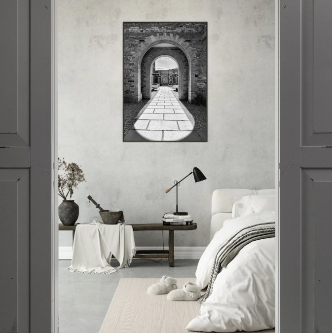
Composition becomes everything in black-and-white photography. Without the visual weight of color, every line, shape, and form carries responsibility for guiding the eye and anchoring the image. The familiar principles, leading lines, negative space, the rule of thirds, behave differently once color is removed, and different genres demand different approaches.
Why Monochrome Composition Is Different
In color work, a bright red door can pull the eye even if it sits awkwardly in the frame. In black and white, that door only pulls if its tone contrasts with its surroundings.
Strong composition in black and white relies on recognizable patterns. Leading lines, a road, a fence, a river, draw viewers in, while shapes and form create interest: the curve of a hillside, the geometry of a building, the silhouette of a person. In black-and-white photography, negative space isn't wasted; it's breathing room that makes your subject stronger.
Genre-Specific Composition Notes
Different subjects reward different instincts. A few patterns we've noticed:
- Architecture: Look for rhythm and repetition, windows, columns, stairwells. Strong shadows become graphic elements. Shoot when the sun is low so shadows add depth rather than flattening the facade.
- Street: Silhouettes and gestures carry the frame. Wait for a subject to cross a bright patch of pavement or pass in front of a dark wall. The contrast does the work.
- Wildlife: Texture and eye contact matter more than color. Side lighting reveals fur and feather detail; backlighting creates rim-lit silhouettes that read beautifully in monochrome.
- Product: Form and reflection replace color as the selling point. A single hard light source creates crisp shadows that define shape; soft light flattens and can make products look dull.
- Night: Highlights become the subject. Streetlights, neon signs, and lit windows against deep shadow create natural high-contrast scenes. Long exposures smooth water and clouds into tonal gradients.
Common Composition Mistakes in Monochrome
A few problems show up again and again:
- Merged tones: Two subjects that look different in color but read as the same gray. Fix it by shifting your angle, changing the light, or using a channel adjustment in editing.
- Weak subject separation: The subject blends into the background. A rim light, a darker background, or a tighter crop usually solves it.
- Clipped highlights: Bright areas with no detail. Once they're gone, they're gone, check the histogram and expose to protect them.
- Blocked shadows: Dark areas with no detail. Sometimes intentional, often accidental. If you want shadow detail, expose slightly brighter and recover in editing.
- Overprocessing: Halos around edges, crunchy textures, unnatural contrast. If you can see the editing, pull back.
Composition as Storytelling
The rule of thirds, diagonal lines, and layering of foreground, middle ground, and background all matter more in monochrome work because you can't rely on color to separate elements.
The black-and-white images that stay with us usually share one quality: composition and tonal structure doing the same job. The lines lead somewhere, the light falls where it should, and the eye knows where to rest, that alignment separates a snapshot from a photograph you want to live with.
Light and Shadow: The Heart of Monochrome Vision
Light and shadow interplay is where black-and-white photography truly lives, how light shapes form, how shadow creates mystery, how the two together build mood and emotion.
In color photography, light is often secondary to the subject's color.
Understanding light in black-and-white photography means seeing tones rather than hues.
This is why shooting black and white teaches so many photographers to see light differently: you stop thinking about whether light is warm or cool and start thinking about how it shapes form.
Gallery Wall Ideas With Black-and-White Photos
When we design gallery walls with black-and-white photos, we think about balance: mixing portrait and landscape orientations, varying frame sizes, and spacing them so the arrangement feels intentional.
Black-and-white photography complements almost any décor style: minimalist rooms benefit from the visual simplicity, warm eclectic spaces gain contrast and focus, and even maximalist interiors feel grounded when anchored by monochrome wall art.
Consider creating visual flow by choosing images that share a theme, all landscapes, all urban scenes, all portraits, or by mixing subjects but keeping consistent tonal ranges.
How to Choose Wall Art for a Living Room
Choosing wall art for a living room means balancing personal taste, the room's existing palette, and the feeling you want when you walk in.
Start by assessing your space: wall color, furniture, natural light.
Think about the mood. Do you want your living room to feel energetic, calm, adventurous, or grounded?
The Smithsonian's guide to art curation suggests that personal connection matters more than design rules.
Making Black and White Work in Your Space
Integrating black-and-white photography into your home means thinking about how it interacts with your décor, lighting, and color palette.
Black-and-white images work best as intentional anchors rather than afterthoughts.
Lighting affects how black-and-white photographs appear.
Framing and matting influence how an image reads in your space.
Consider how you'll display your black-and-white photography. The Getty Museum's framing recommendations emphasize that how you present artwork matters as much as the artwork itself.
At CaliCuration, we create black-and-white photography that works as both fine art and functional décor. Our Central Park Framed Poster in Black & White Summer Glow brings architectural calm and urban sophistication to living spaces. The Upstate New York Summer Lake Framed Poster offers serene landscape tones that ground a room in quiet beauty. And our Hollywood Hills City Lights Framed Poster captures dramatic urban mood that works in contemporary or eclectic spaces alike.


Black-and-white photography endures because it speaks a universal language: light, shadow, form, and feeling. Explore our curated collections and find the pieces that resonate with how you want your home to feel.
Frequently Asked Questions
What is contrast in black and white photography?
Contrast in black and white photography is the difference between the lightest highlights and darkest shadows in an image. Strong contrast makes subjects pop, draws the eye to specific areas, and creates visual drama. Monochrome emphasizes this interplay because without color, contrast becomes the primary tool for guiding a viewer's attention and building mood. Subtle tonal shifts can suggest depth and emotion in ways color sometimes masks.
How do you choose black-and-white photos for wall art?
Look for images with strong composition, compelling light and shadow, and clear subject matter that doesn't rely on color for impact. Consider the mood you want: dramatic and moody, serene and minimalist, or rich in texture and detail. Think about your space's existing tones and whether the photograph will anchor a gallery wall or stand alone. Our black and white framed posters, like the Hollywood Hills New Moon or Central Park Summer, work across minimalist, modern, and eclectic interiors because monochrome adapts to any color palette.
Where does black-and-white photography look best in a home?
Black and white prints work beautifully in living rooms, bedrooms, home offices, and entryways. They pair naturally with neutral walls and complement both colorful and monochromatic décor without competing. Gallery walls benefit from black and white's timeless quality—it lets you mix prints from different eras and styles. The simplicity of monochrome also creates calm in spaces where you want focus and clarity, making it ideal for creative studios or quiet reading nooks.
Is black and white photography the same as monochromatic?
Black and white and monochromatic are closely related but not identical. Black and white uses only grayscale tones, while monochromatic refers to any single-color scheme—which can be shades of blue, sepia, or another hue. Black and white is a specific type of monochrome. Both styles simplify visual perception by removing color distraction, letting viewers focus on light, shadow, composition, and emotional storytelling.